


Admin

AI Dashboard UX Case Study: How Context-Aware Design Can Simplify Enterprise...
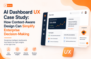
Enterprise dashboards have traditionally been designed around displaying as much information as possible. But as organizations collect more data, this approach can create a...
Enterprise UX Industry Report 2026: The Shift From Screens to Intelligent...
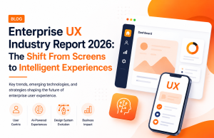
Enterprise UX is entering a new phase. For years, organizations focused on making software easier to navigate. In 2026, the bigger challenge is making...
Enterprise UX Decision Framework: How to Choose the Right Design Strategy...
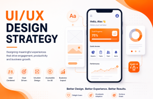
Enterprise UX is becoming harder to get right. Modern products must support complex workflows, multiple user roles, AI-powered features, accessibility requirements, and increasingly fragmented...
UX Benchmark Report 2026: What High-Performing Enterprise Products Have in Common
Enterprise software has evolved beyond simply delivering functionality. Today, the most successful digital products are measured by how effectively they help employees work, customers...
The Complete Guide to Enterprise UX Strategy in 2026: Principles, AI...
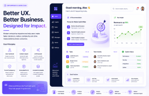
Enterprise software is no longer judged solely by functionality. Today's digital products are evaluated by how efficiently employees complete tasks, how quickly customers achieve...
Decision-Centric UX: Why Enterprise Interfaces Should Help Users Decide, Not Just...
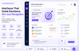
Enterprise applications have become increasingly powerful, but they have also become increasingly complex. Employees often spend more time navigating dashboards, searching for reports, and...
Intent-Driven UX: Why Understanding User Goals Is the Next Competitive Advantage
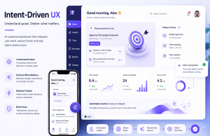
Enterprise software has evolved dramatically over the past decade. Organizations have invested in cloud platforms, AI capabilities, automation, and data analytics to improve operational...
Predictive UX: How Enterprise Applications Are Learning Before Users Ask
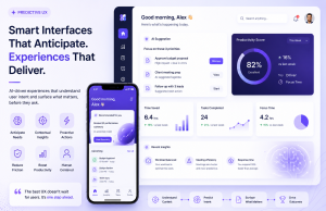
Enterprise software has traditionally relied on users to initiate every action—searching for reports, navigating dashboards, approving workflows, and finding information manually. While functional, this...
Ambient UX: The Future of Enterprise Software Is Becoming Invisible
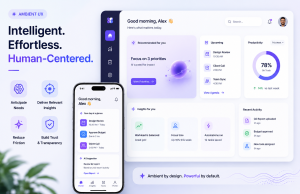
Enterprise software is undergoing a fundamental transformation. Employees no longer want applications that simply respond to commands they expect systems that anticipate needs, automate...
Invisible UX: Why the Best AI Experiences Feel Effortless
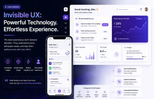
Artificial intelligence is transforming enterprise software, but users aren't looking for more buttons, dashboards, or complicated workflows. They want technology that helps them accomplish...