

Restaurant experiences are no longer limited to the dining room.
A customer may discover a restaurant through search, browse its menu on a smartphone, reserve a table, place a pickup order, scan a QR code at the table, pay digitally, and later return through a loyalty program.
Every one of those interactions is part of the restaurant’s digital experience.
That makes restaurant UI/UX design more important than simply making an app or website look attractive.
The strongest restaurant experiences reduce friction between discovery, menu browsing, ordering, payment, reservations, and repeat visits.
Recent restaurant research shows that consumers increasingly move between channels during the same customer journey. DoorDash’s 2026 restaurant trends research describes guests discovering restaurants through different channels, ordering, dining, and returning based on how connected the overall experience feels.
For restaurant brands, the design challenge is therefore straightforward:
How can UI/UX make every digital interaction feel simple, fast, and connected?
Why Restaurant UI/UX Design Is Different
Restaurant products have a unique UX challenge.
Users usually do not want to spend much time learning the interface.
When someone opens a restaurant app, they may already know exactly what they want:
- View the menu
- Order food
- Book a table
- Find restaurant hours
- Track an order
- Redeem a reward
- Repeat a previous order
The interface needs to support these actions immediately.
A complex navigation system can create unnecessary friction.
For example, requiring customers to open multiple menus before finding the food menu, forcing them to create an account before browsing, or hiding the checkout button behind several screens can negatively affect the experience.
Restaurant UI/UX should therefore prioritize task completion over feature visibility.
Menu Design Should Be the Center of the Experience
The menu is one of the most important screens in restaurant UX.
Traditional digital menus often reproduce printed menus online: long lists, small images, multiple categories, and large blocks of descriptions.
Modern restaurant UX is moving toward more visual experiences.
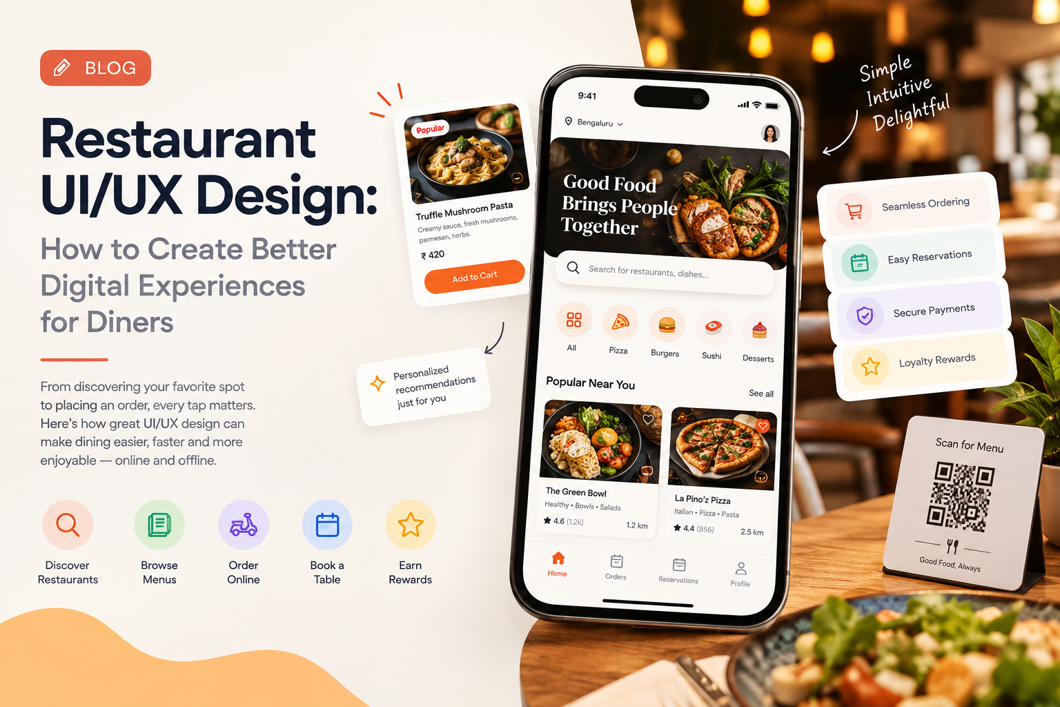
Current restaurant app design discussions emphasize visual-first menus, personalized recommendations, clear food photography, and simplified browsing rather than dense menu interfaces.
A strong menu interface can include:
- High-quality food photography
- Clear categories
- Dietary indicators
- Popular-item labels
- Customization options
- Price visibility
- Preparation information
- Add-to-order controls
- Recommended combinations
The goal is not to show everything simultaneously.
The goal is to help users decide quickly.
Restaurant Websites Need a Mobile-First UX
Restaurant websites are frequently accessed when customers are away from a desktop.
Someone searching for a restaurant may be standing on a street, sitting in a car, planning dinner, or deciding where to order lunch.
The website therefore needs to prioritize mobile actions.
The most important options should be immediately visible:
View Menu | Order Now | Reserve Table | Get Directions
Instead of making users search through navigation menus, restaurants can place these actions prominently within the first screen.
Mobile-first restaurant UX also requires:
- Large touch targets
- Readable typography
- Fast-loading imagery
- Sticky ordering controls
- Simple navigation
- Short checkout flows
- Accessible menus
- Easy reservation access
The principle is simple:
The customer should not have to work to figure out what to do next.
Designing a Better Restaurant Ordering Flow
Ordering is where UX directly connects to revenue.
A typical ordering journey might include:
Browse → Select Item → Customize → Add to Cart → Review → Payment → Confirmation.
Every additional decision or unnecessary screen creates another opportunity for abandonment.
Restaurant UX designers should therefore reduce unnecessary steps.
For example, a returning customer could see:
“Order Again”
instead of rebuilding the same order from scratch.
A customer who regularly orders vegetarian meals could receive relevant recommendations rather than generic promotions.
A customer picking up food could see pickup timing before completing payment.
These small improvements make the interface feel more intelligent without making it complicated.
Personalization Should Feel Useful, Not Intrusive
Personalization is becoming a bigger part of restaurant digital experiences.
Restaurant brands are increasingly connecting loyalty, ordering history, preferences, and customer engagement. Restaurant industry research from SevenRooms, for example, highlights connected guest experiences and personalization as important drivers of loyalty and growth.
But personalization needs restraint.
Instead of overwhelming customers with recommendations, a restaurant app could surface:
Your usual order
Popular near you
Try something similar
Available again today
These recommendations are easier to understand because they relate directly to the customer’s context.
The UX principle is:
Personalization should reduce decision effort rather than create more decisions.
QR Menus Need Better UX Too
QR menus became common across restaurants, but simply replacing paper with a QR code does not automatically create a good digital experience.
A poorly designed QR menu may require:
- Multiple redirects
- Slow page loading
- Tiny text
- Difficult category navigation
- Separate pages for every item
- No search
- No ordering integration
A better QR menu can allow customers to quickly browse categories, view food images, understand ingredients, customize dishes, and move directly into ordering.
This turns the QR experience from a digital copy of the printed menu into a useful interaction layer.
Restaurant UX Must Connect Dine-In and Digital Experiences
The best restaurant experiences do not treat digital and physical interactions as separate.
A guest could scan a table QR code, browse the menu, order another dish, request assistance, pay the bill, and automatically receive loyalty credit.
The interface supports the physical experience instead of competing with it.
This is particularly important as restaurant technology becomes increasingly connected.
Industry research shows strong interest in connecting ordering, delivery, reservations, and guest data rather than managing them as isolated systems.
From a UX perspective, this means customers should not feel like they are moving between unrelated systems.
Their account, preferences, rewards, order history, and payment experience should feel continuous.
Accessibility Should Be Part of Restaurant UX
Restaurant applications and websites also need to work for customers with different abilities.
Accessibility considerations include:
- Sufficient color contrast
- Readable font sizes
- Screen-reader support
- Descriptive image alternatives
- Clear form labels
- Large interactive elements
- Keyboard accessibility
- Simple language
- Avoiding color-only status indicators
Accessibility is especially important for food ordering because menus can contain large amounts of information.
A customer should be able to understand prices, ingredients, customization options, and checkout states without depending entirely on visual cues.
Speed Is a UX Feature
Restaurant customers are often making quick decisions.
Slow websites, delayed menu images, or checkout screens that take too long to load can make an otherwise attractive experience frustrating.
Performance should therefore be considered part of restaurant UI/UX.
Design teams can work with engineering teams to:
- Optimize food images
- Prioritize above-the-fold content
- Reduce unnecessary animations
- Simplify checkout
- Cache frequently accessed information
- Minimize unnecessary network requests
A beautiful restaurant interface that takes too long to load is still a poor user experience.
Designing Restaurant Loyalty Experiences
Restaurant loyalty programs should not feel like separate systems.
A customer should be able to see their:
- Points
- Rewards
- Progress
- Available offers
- Order history
- Personalized promotions
without navigating through a complicated account area.
The best loyalty UX connects rewards directly to actions.
For example:
“You’re 2 orders away from your next reward.”
That communicates progress immediately.
Restaurant brands are increasingly redesigning their apps around loyalty, personalization, and ongoing guest engagement rather than treating loyalty as a simple points feature.
How to Measure Restaurant UX Success
Restaurant UI/UX should be evaluated through behavior rather than visual appeal alone.
Important metrics include:
- Menu engagement
- Menu-to-cart conversion
- Cart abandonment
- Checkout completion
- Reservation completion
- Repeat ordering
- Loyalty engagement
- Search usage
- Order completion time
- Customer support requests
A restaurant may have an attractive interface but poor conversion.
Another restaurant may have a visually simple interface but a highly efficient ordering journey.
The second experience is often more valuable.
The Future of Restaurant UI/UX
Restaurant UX is moving toward connected, visual, personalized, and increasingly intelligent experiences.
The customer may discover a restaurant through AI, browse a visual menu, receive a personalized recommendation, order through an app, earn loyalty points, and later receive a relevant offer.
The experience should feel like one journey rather than several disconnected products.
Companies such as GeekyAnts have also published work around modern product engineering and digital experiences, reflecting the broader shift toward building connected, technology-driven customer experiences rather than isolated interfaces.
For restaurant brands, the biggest opportunity is not adding more features.
It is making existing interactions easier.
The best restaurant UI/UX answers one question at every stage:
“What does the customer want to do next, and how can the interface make that action effortless?”