

Enterprise dashboards have traditionally been designed around displaying as much information as possible. But as organizations collect more data, this approach can create a new problem: information overload.
An executive may have access to hundreds of metrics but only need five of them to make an immediate decision. A finance manager may require completely different information from a product leader. A modern UX strategy must therefore move beyond static dashboards toward experiences that understand user context.
This is where context-aware dashboard UX is becoming increasingly important.
The Problem: Too Much Information, Too Little Context
Consider an enterprise platform used by executives, managers, analysts, and operational teams.
A traditional dashboard may present:
- Dozens of KPIs
- Multiple charts
- Detailed reports
- Notifications
- Filters
- Operational tables
While the information is valuable, users still have to determine what actually matters.
This creates three common problems:
- Higher cognitive load
- Longer decision-making cycles
- Lower engagement with important features
The UX challenge is not simply to organize more information. It is to determine which information deserves attention.
The UX Approach: Design Around User Intent
A context-aware dashboard begins by understanding the user’s role, current workflow, historical behavior, and business priorities.
An executive dashboard might prioritize:
- Revenue changes
- Strategic risks
- Major customer issues
- Forecast deviations
- Critical operational alerts
An operations manager may instead see:
- Active incidents
- Team performance
- Workflow bottlenecks
- Resource availability
- Pending approvals
The same underlying platform can therefore provide significantly different experiences without creating completely separate products.
Where AI Fits Into the Experience
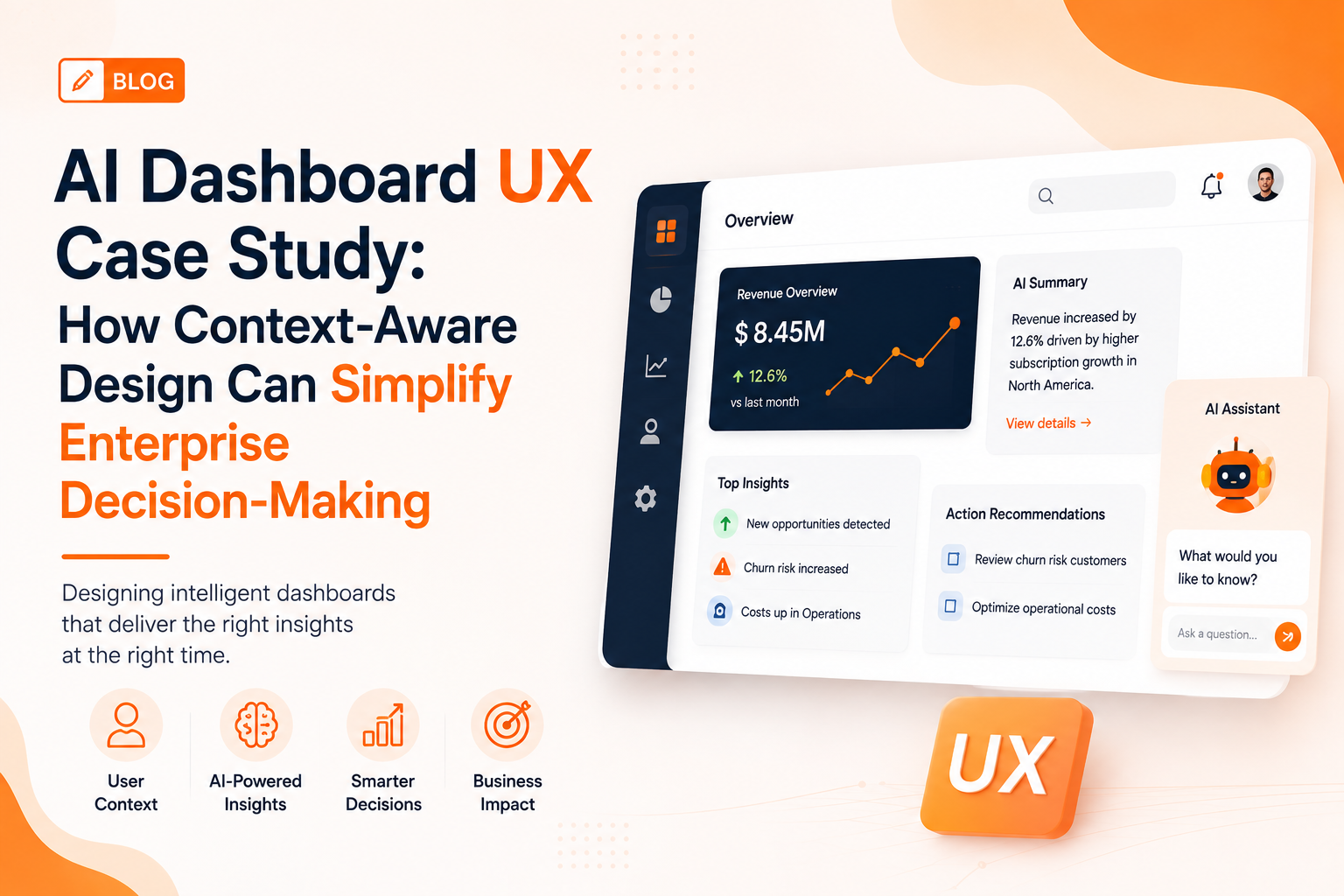
AI can make these dashboards more adaptive.
Instead of simply displaying data, an AI-enabled interface can:
- Summarize important changes
- Detect unusual patterns
- Explain why a metric changed
- Recommend next actions
- Surface relevant reports
- Answer questions using natural language
For example, instead of requiring a manager to compare several charts, the interface could highlight that operational costs increased significantly and provide the main contributing factors.
The objective is not to replace human decision-making. It is to reduce the effort required to reach a decision.
Designing Trust Into AI Dashboards
AI-driven UX introduces an important design requirement: transparency.
Users should understand why an insight or recommendation was presented.
Effective interfaces can provide:
- Data sources
- Confidence indicators
- Explanation panels
- Human approval controls
- Links to underlying information
- Options to correct inaccurate suggestions
This creates a balance between automation and user control.
Measuring the UX Impact
The success of an intelligent dashboard should be measured through outcomes.
Useful metrics include:
- Time required to find important information
- Decision-making time
- Dashboard engagement
- Task completion rates
- AI recommendation acceptance
- User satisfaction
A reduction in navigation time can be particularly valuable across large enterprise teams.
Industry Perspective
The product engineering industry is increasingly bringing UX strategy, AI engineering, analytics, and cloud development together to create more intelligent enterprise products. Companies such as GeekyAnts have publicly showcased work across fintech, healthcare, retail, and SaaS, reflecting this wider shift toward outcome-driven digital experiences.
Conclusion
The future of enterprise dashboards is not about showing more information.
It is about showing the right information at the right time in the right context.
Organizations that combine user research, intelligent personalization, AI-assisted insights, and strong information architecture can transform dashboards from reporting tools into decision-support experiences.