

From ordering food and groceries to scheduling package pickups, delivery apps have become an important part of everyday digital experiences.
But users do not want to spend several minutes figuring out how to place an order.
They want to quickly find what they need, see the price, choose a delivery option, pay, and know when their order will arrive.
This makes delivery app UX design particularly important.
A well-designed delivery experience reduces unnecessary steps and gives users clear information at every stage of the order journey.
1. Make Search the Starting Point
Many delivery experiences begin with a specific need.
A user may search for a restaurant, grocery item, pharmacy product, or package service.
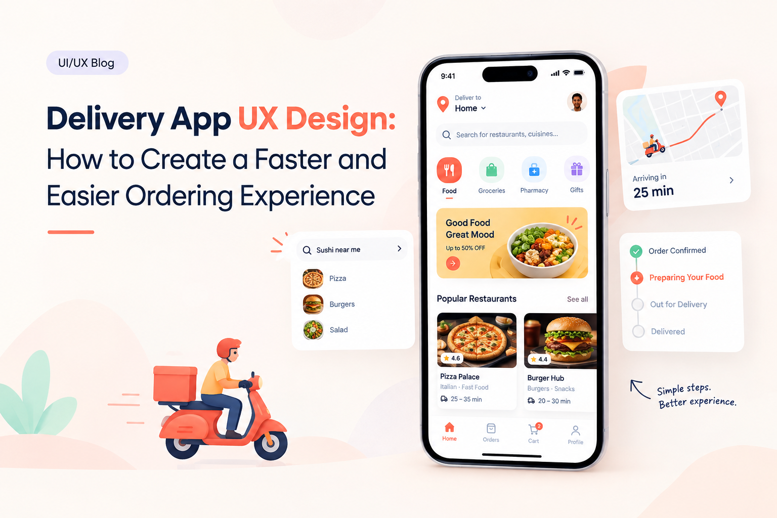
The search interface should be immediately visible and easy to use.
Useful capabilities can include:
- Keyword search
- Categories
- Recent searches
- Suggestions
- Filters
- Location-based results
The goal is to help users find what they need without navigating through multiple unrelated screens.
2. Keep the Home Screen Focused
Delivery apps can contain a large amount of content.
Restaurants, products, promotions, categories, recommendations, banners, and delivery options can quickly compete for attention.
The home screen should prioritize the actions users perform most frequently.
A clear hierarchy might include:
Search
Categories
Recent or Popular Items
Active Orders
Personalized Recommendations
The exact structure depends on the type of delivery product.
3. Show Delivery Information Early
One of the most important questions users have is:
“When will my order arrive?”
Delivery estimates should be visible before users reach the final checkout stage whenever possible.
For example:
Estimated delivery: 25–35 min
Providing this information early helps users compare available options more effectively.
4. Simplify Product or Restaurant Discovery
Whether a user is selecting a meal or purchasing groceries, discovery should not feel complicated.
Cards can highlight essential information such as:
- Product or restaurant name
- Price
- Rating
- Delivery estimate
- Availability
- Relevant offers
Users should be able to understand the key differences between options without opening every result.
5. Design a Clear Cart
The cart is where users review their decision before checkout.
It should clearly display:
- Items
- Quantity
- Price
- Delivery fee
- Discounts
- Taxes where applicable
- Final total
Users should be able to edit quantities or remove items easily.
A clear cart prevents unpleasant surprises later.
6. Reduce Checkout Friction
Checkout should focus on completing the order rather than collecting unnecessary information.
A typical journey can be:
Cart → Address → Delivery Option → Payment → Review → Order
Saved addresses and payment methods can make repeat purchases faster.
For first-time users, the interface should explain required information clearly.
7. Make Address Selection Easy
Address entry can be surprisingly frustrating in delivery applications.
Users may need to enter:
- Street address
- Apartment or building
- Floor
- Landmark
- Delivery instructions
Map-based selection, saved addresses, and location suggestions can reduce the effort involved.
Users should also have an opportunity to verify the address before placing the order.
8. Make Order Tracking Visual
After checkout, users want reassurance that the order is progressing.
A visual status system can show:
Order Confirmed
↓
Being Prepared
↓
Picked Up
↓
Out for Delivery
↓
Delivered
For courier-based services, a live map can provide additional information when appropriate.
The interface should communicate status without requiring users to repeatedly refresh the application.
9. Design for Delays and Problems
Not every delivery will happen exactly as planned.
Weather, traffic, restaurant delays, inventory issues, and other factors can affect delivery times.
Instead of simply showing:
“Delayed.”
the interface can provide more useful context:
“Your order is taking longer than expected. Updated delivery estimate: 8:40 PM.”
Clear communication can make unexpected situations easier to manage.
10. Make Reordering Easy
Many delivery purchases are repetitive.
Customers may order the same meal, groceries, household products, or other items regularly.
A Reorder option can reduce the number of steps required for repeat purchases.
Other useful features include:
- Recent orders
- Favorites
- Saved items
- Frequently purchased products
These features turn repeat ordering into a faster journey.
11. Use Notifications Carefully
Notifications are useful when they provide timely information.
Examples include:
- Order confirmation
- Preparation updates
- Courier assignment
- Delivery arrival
- Payment status
- Delay notifications
Promotional notifications should not overwhelm important operational updates.
Users should also have control over notification preferences.
12. Design for Different Delivery Scenarios
Not every delivery experience is the same.
A food delivery app may focus on speed.
A grocery app may focus on item availability and substitutions.
A courier platform may focus on package tracking.
A pharmacy delivery experience may place greater emphasis on product information and order requirements.
UX should reflect the specific context rather than applying the same interface to every delivery business.
Personalization Can Improve Delivery UX
Returning customers can benefit from personalized experiences.
For example, an application can surface:
- Previous orders
- Favorite restaurants
- Frequently purchased products
- Saved addresses
- Preferred payment methods
- Relevant offers
Personalization should reduce effort without making the interface feel unpredictable.
Accessibility Matters
Delivery apps should be usable by people with different abilities and circumstances.
Important considerations include:
- Readable text
- Clear contrast
- Accessible controls
- Screen-reader compatibility
- Large enough touch targets
- Clear error messages
- Simple navigation
Accessibility can also improve usability for people ordering while multitasking or using smaller screens.
Performance Is Part of UX
Users expect delivery applications to respond quickly.
Slow search, delayed cart updates, or a map that takes too long to load can interrupt the ordering experience.
Performance should therefore be considered alongside visual design.
Optimizing images, API calls, maps, caching, and data loading can contribute to a smoother experience.
A Better Delivery App Journey
The ideal delivery journey should feel straightforward:
Discover → Select → Add to Cart → Checkout → Track → Receive → Reorder
Each step should provide the information users need without unnecessary complexity.
The goal is not to fill the application with features.
It is to make the most common tasks easier.
Final Thoughts
Good delivery app UX design is built around speed, clarity, and confidence.
Users should be able to find what they want, understand the cost, select an address, complete payment, and track their order without unnecessary friction.
Companies such as GeekyAnts work across UI/UX design and product engineering, where delivery experiences can be designed together with mobile interfaces, backend systems, maps, payments, notifications, and real-time tracking.
The strongest delivery UX is often the one that feels almost invisible.
Users simply know what to do, where their order is, and what happens next.