

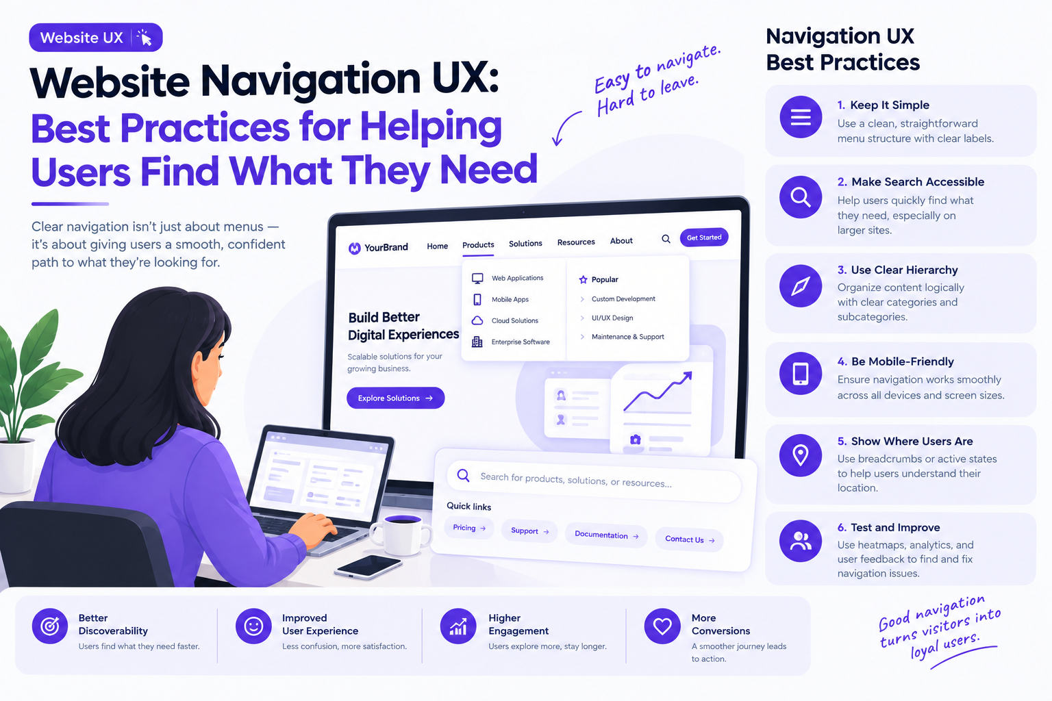
Website Navigation UX: Best Practices for Helping Users Find What They Need
A website can offer excellent content, useful features, and an attractive visual design yet still frustrate visitors if they cannot find what they need.
Confusing menus, unclear labels, deeply nested pages, and inconsistent navigation can turn simple tasks into unnecessary effort. Visitors may leave without discovering important information, completing a purchase, or contacting a business.
Website navigation UX focuses on helping people understand where they are, what a website offers, and how to move between its pages efficiently.
Good navigation is not simply about organizing links. It is about understanding user expectations and creating a clear path through the website.
Why Website Navigation UX Matters
Navigation influences how users discover content, explore products, and complete tasks.
When navigation is difficult to understand, users must spend additional time figuring out the website instead of focusing on their goals.
Common navigation problems include:
- Menu labels that are vague or overly technical
- Too many top-level navigation items
- Important pages hidden several levels deep
- Inconsistent navigation across sections
- Search functionality that produces irrelevant results
- Mobile menus that are difficult to operate
- No clear indication of the user’s current location
These problems can affect engagement, accessibility, and conversion rates.
Effective navigation reduces uncertainty and helps users move through a website with confidence.
1. Understand What Users Are Looking For
The first step in navigation design is understanding the information and actions visitors expect to find.
A corporate website may need to help users explore services, review case studies, understand industry expertise, and contact the business. An online store needs to make categories, product details, account options, and shopping tools easy to access.
The navigation structure should reflect these user goals rather than simply mirror the company’s internal departments.
Useful research methods include reviewing website analytics, interviewing users, analyzing search queries, and conducting card-sorting exercises.
Card sorting can reveal how users naturally group information and which labels make sense to them.
The goal is to create a structure that reflects users’ mental models, not just the organization’s internal terminology.
2. Build a Clear Information Architecture
Information architecture defines how website content is grouped, labeled, and connected.
A useful structure allows visitors to move from broad categories to more specific information without unnecessary detours.
For example, an e-commerce website might organize its content as:
- Home
- Shop
- Categories
- New arrivals
- Best sellers
- Offers
- Help and support
- Account and orders
The appropriate structure depends on the number of products, content types, and user tasks.
Avoid creating categories simply because the organization has different internal teams. Visitors generally care more about what they can do or find than how the business is structured.
Before finalizing the architecture, test whether users can locate important pages without assistance.
3. Use Clear and Familiar Navigation Labels
Navigation labels should communicate what users will find after selecting them.
Labels such as “Products,” “Pricing,” “Resources,” and “Contact” are often easier to interpret than creative alternatives that require explanation.
However, familiar language should still reflect the actual content.
For example, a menu labeled “Resources” should lead to a recognizable collection of useful materials rather than unrelated company announcements.
Avoid jargon, ambiguous abbreviations, and labels that sound similar but lead to different destinations.
Consistency also matters. If a website uses “Solutions” in one section and “Services” in another to describe the same concept, visitors may wonder whether the two categories are different.
Clear labels reduce the amount of interpretation users must perform.
4. Keep the Main Navigation Focused
Adding more links to the main menu may appear to improve discoverability, but an overcrowded navigation bar can make important destinations harder to identify.
Prioritize pages that support the most common and valuable user journeys.
Secondary destinations can be organized into dropdown menus, contextual navigation, footer links, or dedicated section pages where appropriate.
There is no universal ideal number of navigation items. The right amount depends on the complexity of the website and how easily users can understand the available choices.
If a website has many distinct content areas, grouping related destinations under meaningful headings can make the structure easier to scan.
The objective is to reduce clutter without hiding important functionality.
5. Design Dropdown Menus Carefully
Dropdown menus can provide access to related pages without filling the entire navigation bar with links.
However, poorly implemented dropdowns can become difficult to use, particularly when they contain multiple columns, nested menus, or small interactive targets.
Follow these principles:
- Group links according to meaningful categories.
- Use descriptive headings.
- Keep menu structures predictable.
- Ensure keyboard users can open and navigate menus.
- Provide clear focus and hover states.
- Prevent menus from closing unexpectedly during interaction.
- Make touch interactions work on mobile devices.
Large websites may benefit from a carefully designed mega menu, especially when users need to explore many product categories.
However, a large menu should not become a substitute for a coherent information architecture.
6. Make the Current Location Obvious
Visitors should be able to understand where they are within the website.
Visual indicators can highlight the active navigation item, while breadcrumbs can show the path from a broader section to a specific page.
For example:
Home → Resources → Design Guides → Navigation UX
Breadcrumbs are particularly useful on content-heavy websites, product catalogs, and complex enterprise platforms.
They also provide a convenient way to return to a higher-level category without relying entirely on the browser’s back button.
Use them when they reflect a meaningful hierarchy. They may add little value to simple websites with very shallow structures.
7. Design Mobile Navigation for Touch
Desktop navigation patterns do not always translate well to smaller screens.
A horizontal navigation bar may need to become a collapsible menu, while secondary links may need to move into separate screens or expandable sections.
Mobile navigation should prioritize the actions users need most frequently.
Important considerations include:
- Comfortable touch targets
- Readable labels
- Clear menu-open and menu-close controls
- Predictable back navigation
- Limited nesting
- Appropriate spacing between interactive elements
- Consistent access to essential actions
Do not simply shrink the desktop menu to fit the screen.
Test navigation on real mobile devices, including different screen sizes and orientations. Consider how the menu behaves when users scroll, zoom, or use assistive technologies.
8. Make Website Search Part of the Navigation Experience
For websites with large amounts of content or many products, search can be one of the fastest ways to reach a destination.
A useful search experience should provide a visible search field or recognizable search control, relevant results, clear empty states, and understandable error handling.
Autocomplete can help users discover available categories or correct incomplete queries.
For product websites, filters and sorting options can help users narrow results based on price, availability, features, or other meaningful attributes.
Search should complement navigation rather than replace it. Visitors who do not know the exact terminology may still rely on categories and exploratory browsing.
Review common search terms and unsuccessful queries to identify missing content, confusing labels, or opportunities to improve the information architecture.
9. Maintain Navigation Consistency Across Pages
Navigation should behave consistently throughout the website.
If the main menu changes unexpectedly between pages, users may need to relearn the interface as they move between sections.
Use consistent placement, typography, interaction behavior, and naming conventions for primary navigation components.
Consistency does not mean every page must have an identical layout. A checkout flow or focused task interface may need fewer distractions.
The important distinction is whether a change supports the user’s current task or creates unnecessary uncertainty.
Shared design components and clear design-system guidelines can help teams maintain consistency as the website grows.
10. Design Navigation for Accessibility
Accessible navigation helps people use a website with keyboards, screen readers, magnification, and other assistive technologies.
Navigation links should have meaningful names and clear focus indicators. Interactive menus should support keyboard operation, and focus should behave predictably when menus open or close.
Do not rely on hover alone to reveal essential navigation options.
Color should not be the only indicator of the current location, and the visual design should provide sufficient contrast between text and its background.
Use semantic HTML elements and appropriate accessible attributes for interactive components. Test the experience with keyboard navigation and assistive technologies instead of assuming that a visually correct menu is accessible.
Accessibility improvements often make navigation clearer for all visitors, not just those using assistive tools.
11. Optimize Navigation for Business Goals Without Hiding User Choices
Businesses may want visitors to book a demo, purchase a product, subscribe, or request a consultation.
Primary calls to action can make these next steps easier to discover.
However, navigation should still help visitors explore information and make informed decisions.
For example, a business website might highlight “Book a Demo” while keeping product details, pricing information, and customer resources easy to find.
Avoid using confusing labels, excessive pop-ups, or deliberately hidden options to force users toward a conversion.
Trustworthy navigation helps people understand their choices rather than manipulating them.
12. Test Navigation With Real User Tasks
Navigation testing should focus on whether people can complete common tasks successfully.
Useful tasks might include finding a particular service, locating a return policy, comparing product categories, or reaching a support page.
Observe where users hesitate, choose the wrong link, or return repeatedly to the main menu.
Useful measures include:
- Time needed to find a destination
- Task completion rate
- Navigation errors
- Search usage and unsuccessful queries
- Exit rates on important pages
- Click patterns across major sections
Analytics can identify areas that deserve attention, while usability testing can explain why people struggle.
Tree testing is another useful technique for evaluating whether users can locate information within a proposed navigation hierarchy before the full interface is built.
A Practical Website Navigation UX Checklist
Before launching a website or redesign, verify that:
- The information architecture reflects user needs.
- Navigation labels are clear and consistent.
- Important destinations are easy to discover.
- Dropdown menus behave predictably.
- Breadcrumbs are used where helpful.
- Mobile navigation supports touch interaction.
- Search produces relevant and understandable results.
- Keyboard navigation works correctly.
- Active states and focus indicators are visible.
- Important tasks can be completed without unnecessary steps.
Companies such as GeekyAnts work across UI/UX design and digital product engineering, where navigation decisions need to align with both user behavior and the wider product architecture.
Final Thoughts
Website navigation UX determines how easily visitors can explore information and complete important tasks.
Clear information architecture, familiar labels, focused menus, accessible interactions, and useful search functionality create a more predictable experience.
The best navigation is not necessarily the most elaborate. It is the one that helps users understand their options and reach their destination with minimal effort.
When users spend less time figuring out where to go, they can spend more time accomplishing what they came to do.