

Forms are among the most common interactions in digital products. Users encounter them when creating accounts, requesting quotes, booking appointments, applying for services, completing purchases, and submitting business information.
Yet, even a short form can create friction when questions are unclear, validation messages appear too late, or users are asked to provide unnecessary information.
Form UX design focuses on making these interactions understandable, efficient, and accessible. The goal is not simply to create attractive input fields but to help users complete a task with minimal confusion and effort.
For businesses, improving form usability can support higher conversion rates, fewer errors, and a smoother customer experience.
Why Form UX Design Matters
Every field introduces a small decision for the user. They must understand what information is required, determine the correct response, and enter it in the expected format.
As forms become longer or more complicated, the likelihood of mistakes and abandonment can increase.
Common form usability problems include:
- Asking for information that is not necessary
- Using unclear labels or technical terminology
- Showing validation errors only after submission
- Requiring users to re-enter information
- Providing confusing password requirements
- Creating layouts that work poorly on mobile devices
- Failing to explain why sensitive information is needed
Good form design removes unnecessary decisions and provides guidance at the moment users need it.
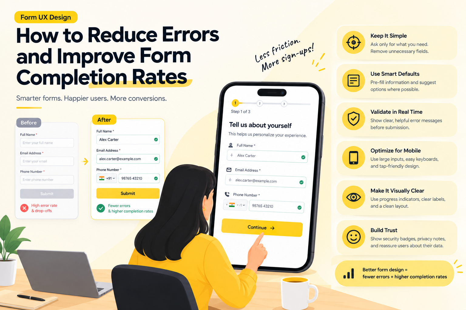
1. Ask Only for Essential Information
One of the most effective ways to improve a form is to remove fields that do not support the immediate task.
For example, a newsletter subscription usually does not need a phone number, company size, job title, and postal address.
Additional information may be useful for analytics or sales qualification, but every extra field should have a clear purpose.
Before adding a field, ask:
- Is this information essential at this stage?
- Can it be collected later?
- Can the system retrieve it automatically?
- Does the user understand why it is required?
For multi-stage customer journeys, progressive profiling can help. Collect the minimum information needed initially, then request additional details when they become relevant.
The best form is not necessarily the shortest one. It is the one that asks for the right information at the right time.
2. Use Clear Labels and Helpful Instructions
Users should not have to guess what a field means.
Labels such as “Full name,” “Work email,” and “Appointment date” are usually easier to understand than internal business terminology.
Avoid relying on placeholder text as the only label. Placeholder text disappears when users start typing and can be difficult to read because of its styling.
Instead, keep labels visible and use supporting text when additional explanation is necessary.
For example, a field labeled “Company registration number” might include a short description explaining where users can find that number.
Instructions should be concise, specific, and positioned close to the relevant field.
3. Choose the Right Input Type
Different types of information require different input controls.
A date picker may be appropriate for selecting an appointment date. A dropdown can work well for a short list of predefined choices. Radio buttons can make a small set of mutually exclusive options visible without requiring an extra click.
For longer lists, searchable selection controls may be more efficient than scrolling through dozens of options.
On mobile devices, use appropriate input types to bring up suitable keyboards. An email field, for example, should make entering an email address convenient.
However, do not use specialized controls merely because they look modern. Consider how frequently users interact with the field, how many choices exist, and whether the control works well with assistive technologies.
4. Group Related Fields Logically
Long forms become easier to understand when related questions are grouped into meaningful sections.
A service application might separate information into:
- Personal details
- Service requirements
- Contact preferences
- Review and submission
These groups help users understand the overall structure and estimate how much work remains.
For particularly long forms, a step-by-step flow can reduce the feeling of complexity. Each step should have a clear purpose, and users should understand how to move forward or return to earlier sections.
Avoid splitting a simple form into unnecessary steps. Every additional transition creates another interaction that users must complete.
5. Make Required and Optional Fields Obvious
Users need to understand which information is mandatory.
A consistent approach is to mark optional fields explicitly and keep required-field behavior predictable. Another approach is to mark required fields, provided the convention is explained clearly.
Avoid mixing these approaches without a reason.
If a field is optional, users should be able to leave it blank without receiving an error. If it is required, the interface should explain what is missing when the user attempts to continue.
Consistency matters more than the specific convention chosen.
6. Validate Input at the Right Time
Validation helps users correct mistakes, but poorly timed validation can interrupt the task.
For example, displaying an error while a user is still typing an email address may create unnecessary frustration.
A more useful approach is to validate at an appropriate point, such as when the user leaves the field or attempts to continue.
Error messages should explain what went wrong and how to fix it.
Instead of displaying “Invalid input,” a form might say, “Enter an email address in the format [email protected].”
Where possible, preserve the user’s existing entries when validation fails. Losing previously completed information can turn a minor error into a significant usability problem.
7. Design Error States as Carefully as Success States
Errors are a normal part of form completion. Users may mistype a value, misunderstand a question, or encounter a server problem.
The interface should make errors easy to identify and recover from.
Useful practices include:
- Place the message near the relevant field.
- Explain the problem in plain language.
- Identify the correction required.
- Use text and visual indicators rather than color alone.
- Preserve valid information already entered.
- Provide a clear recovery path for system errors.
For forms with multiple errors, a summary at the top can help users understand what needs attention, particularly when the form is long.
Error handling should be accessible to screen readers and should not depend solely on red borders or icons.
8. Improve Mobile Form Usability
Forms that work well on desktop screens can become frustrating on phones.
Small input fields, crowded layouts, difficult dropdowns, and poorly positioned buttons can make completion unnecessarily difficult.
Mobile form design should prioritize readable text, comfortable touch targets, clear spacing, and a logical keyboard sequence.
Other useful considerations include:
- Use appropriate mobile keyboards.
- Keep field labels visible.
- Avoid unnecessary horizontal scrolling.
- Preserve entered information when users navigate backward.
- Make primary actions easy to locate.
- Consider autofill where appropriate.
- Test forms on different screen sizes.
The experience should also account for interruptions. Users may switch apps, receive a call, or temporarily lose connectivity while completing a form.
For longer forms, saving progress can help users return without starting again.
9. Build Trust When Requesting Sensitive Information
Forms frequently request information users may consider private, such as phone numbers, addresses, financial details, or identity documents.
If the purpose of a field is unclear, users may hesitate to continue.
Explain why sensitive information is needed and avoid requesting it before it becomes necessary.
When relevant, provide concise privacy information near the point of collection. Use secure handling practices behind the interface and ensure that consent controls are clear and meaningful.
Do not use preselected consent boxes or confusing wording to pressure users into agreeing to unrelated communications.
Trust is part of form usability. Users should feel informed rather than manipulated.
10. Design Useful Loading and Confirmation States
Submitting a form should provide clear feedback.
If a request takes several seconds, users need to know that the action is being processed. The interface should prevent accidental duplicate submissions where appropriate without making the form appear frozen.
After a successful submission, display a confirmation that explains what happened and what the user can expect next.
For example, a booking form might confirm the appointment details and explain whether a confirmation email will follow.
If submission fails because of a network or server issue, preserve the user’s entries whenever possible and provide a clear retry option.
A successful form interaction should not leave users wondering whether their information was received.
11. Use Conditional Logic Carefully
Some forms need to ask different questions depending on earlier answers.
For example, a support request may display additional fields when a user selects “Billing issue,” while a job application may request portfolio information for certain roles.
Conditional logic can reduce irrelevant questions, but it must remain predictable.
When a new field appears, explain what information is needed. If a user’s earlier answer changes, handle dependent fields consistently so that hidden or obsolete responses are not submitted accidentally.
Test all major answer combinations to ensure that the form remains understandable and that validation behaves correctly.
12. Measure Form Performance and Test Improvements
Form redesign should be based on actual user behavior rather than assumptions.
Useful metrics include:
- Form start rate
- Completion rate
- Field-level error rate
- Abandonment by step
- Time to completion
- Repeated submissions
- Mobile versus desktop performance
Analytics can identify where users stop or make mistakes. Usability testing can then reveal the reasons behind those patterns.
For example, a high abandonment rate near a phone number field might indicate privacy concerns, unclear formatting requirements, or a lack of explanation about how the number will be used.
When testing improvements, change one meaningful part of the experience at a time where practical. A/B testing can help evaluate alternatives when sufficient traffic is available.
A Practical Checklist for Better Form UX
Before launching a form, confirm that:
- Every field serves a clear purpose.
- Labels remain visible and understandable.
- Input controls match the information being collected.
- Required and optional fields are clearly distinguished.
- Validation messages explain how to recover.
- Previously entered information is preserved when possible.
- The form works with keyboards and assistive technologies.
- Mobile layouts are comfortable to use.
- Sensitive data requests are explained.
- Success and failure states are clear.
- Analytics can identify completion problems.
Companies such as GeekyAnts work across UI/UX design and digital product engineering, where thoughtful form design can help connect usability improvements with the wider product experience.
Final Thoughts
Form UX design has a direct influence on how easily people complete important digital tasks.
Reducing unnecessary fields, clarifying labels, choosing appropriate controls, improving validation, and designing for mobile users can remove common sources of friction.
The most effective forms do not simply collect information. They help users understand what is needed, complete the task confidently, and know what happens next.
Every field should earn its place, every error should help users recover, and every submission should provide clear feedback.