


A website can look modern, load reasonably fast, and still frustrate users.
The problem is that many UX issues are not obvious during a quick design review. A button may technically work but appear in the wrong place. Navigation may contain every important page but still make users think too much. A form may only have five fields yet feel unnecessarily difficult to complete.
These small points of friction can affect whether visitors stay, explore, convert, or leave.
For businesses redesigning a website or improving an existing digital product, understanding these less-obvious UX problems is often more valuable than simply following the latest visual design trend.
1. The Website Makes Users Think Too Much
One of the most common UX problems is unnecessary cognitive effort.
Users should not have to interpret complicated labels, understand unfamiliar navigation structures, or figure out what a business actually offers.
For example, a navigation item such as “Solutions” may seem straightforward internally but could mean very different things to different visitors. Clearer labels such as “For Businesses,” “Pricing,” or “Services” can reduce that uncertainty.
Good UX removes decisions that users do not need to make.
2. Important Information Is Buried
Websites often contain the right information but present it in the wrong order.
A visitor may need to scroll through several sections before discovering pricing, product capabilities, contact options, or basic service information.
This becomes especially problematic for users who already know what they want.
A better approach is to identify the most important questions visitors have and make those answers easy to discover. Content hierarchy should reflect user intent rather than the company’s internal structure.
3. Buttons Do Not Clearly Explain What Happens Next
“Submit” is technically a valid button label, but it does not always tell users what they are about to do.
More descriptive actions such as “Get a Quote,” “Start Free Trial,” “Download Report,” or “Book a Demo” create clearer expectations.
The goal is not to make every button longer. It is to make the action understandable.
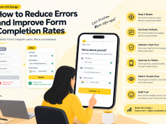
4. Forms Create Small Frustrations
Forms are another area where seemingly minor decisions can create major friction.
Unnecessary fields, unclear validation, poor error messages, awkward mobile keyboards, and aggressive required-field rules can all make completion harder.
UX teams should ask a simple question:
Does every field genuinely need to be here?
If the answer is no, removing it may improve the experience more than redesigning the entire form.
5. Mobile UX Is Treated as a Smaller Desktop Experience
Responsive design is not simply about making desktop content fit onto a smaller screen.
Mobile users interact differently. They tap instead of click, have less screen space, may use one hand, and often operate under less predictable network conditions.
Navigation, buttons, forms, search, filters, and content hierarchy may therefore need to behave differently on mobile.
A website that technically works on a phone can still deliver poor mobile UX.
6. Search Does Not Understand User Intent
Search is often treated as a simple feature rather than a core navigation tool.
On content-heavy or enterprise websites, users may search using incomplete phrases, alternative terminology, abbreviations, or product-specific language.
A search experience that only works when users type the exact expected phrase creates unnecessary friction.
Useful search should handle variations, provide relevant suggestions, preserve the query, and explain when no useful results exist.
7. Error Messages Blame the User
“Invalid input” does not help much.
Good error messaging explains what went wrong and, ideally, how to fix it.
For example, instead of simply saying that a password is invalid, an interface can identify the missing requirement.
Error states should be treated as part of the product experience rather than something added after the main interface is complete.
8. The Interface Gives No Sense of Progress
Long processes become easier when users know where they are.
Checkout flows, onboarding, applications, account setup, and enterprise workflows can benefit from clear progress indicators.
Without them, users may wonder how many steps remain or whether they are close to completion.
Even a simple indicator such as “Step 2 of 4” can make a complex process feel more manageable.
9. Visual Design Competes With the Message
A visually impressive website can still have weak UX if the design overwhelms the content.
Too many animations, competing colors, oversized elements, decorative graphics, and constantly moving sections can make it harder to identify what matters.
Visual design should create hierarchy rather than competition.
The strongest interfaces make important information easier to notice instead of making everything equally prominent.
10. Trust Is Not Designed Into the Experience
Users constantly evaluate whether a website feels trustworthy.
They look for recognizable signals such as transparent pricing, clear contact information, security explanations, customer evidence, professional content, privacy information, and consistent design.
Trust is especially important when users are expected to submit personal information, make payments, or begin a business relationship.
A polished interface without trustworthy information can still create hesitation.
How to Find UX Problems That Users Actually Experience
Teams should not rely entirely on internal design reviews.
Analytics can show where users abandon journeys. Session recordings can reveal repeated behaviors. Heatmaps can highlight overlooked elements. Usability testing can expose confusion that analytics alone cannot explain.
Customer support conversations are also valuable. Repeated questions often reveal places where the interface is failing to communicate clearly.
The objective is not to fix everything simultaneously. Teams should identify the friction points that affect important user journeys and address those first.
Good UX Is About Reducing Unnecessary Work
The biggest UX improvements are not always dramatic redesigns.
Sometimes the best improvement is removing one form field, changing a navigation label, improving an error message, making a CTA clearer, or moving critical information higher on the page.
For enterprise products especially, UX needs to balance business requirements with the user’s ability to complete tasks quickly and confidently.
Companies such as GeekyAnts have also approached product and interface development with this broader engineering perspective, where usability, product requirements, technology, and scalability need to work together.
Ultimately, a successful website does not make users admire the interface first. It helps them accomplish what they came to do without unnecessary effort.