

A website can look modern, load quickly, and have an attractive interface while still being difficult for many people to use.
Small design decisions can create unnecessary barriers. Low-contrast text can be difficult to read. Tiny buttons can be difficult to tap. Forms may not work properly with keyboards or screen readers. Videos may lack captions. Navigation can become confusing for people who rely on assistive technologies.
This is why website accessibility should be considered part of UX design rather than an optional feature.
Accessible UX aims to make digital experiences usable by people with different abilities, devices, and interaction methods.
And the benefits extend beyond users with disabilities. Clear navigation, readable text, captions, useful error messages, and simple interactions can improve the experience for almost everyone.
What Is Website Accessibility?
Website accessibility means designing and developing websites so people with different abilities can perceive, understand, navigate, and interact with them.
Accessibility can involve visual, auditory, physical, cognitive, and speech-related considerations.
It also affects how people interact with a website.
Some users may rely on a keyboard instead of a mouse. Others may use screen readers, magnification, voice control, captions, or other assistive technologies.
A well-designed website should not assume that everyone interacts with a screen in exactly the same way.
1. Make Text Easy to Read
Typography is one of the most visible parts of a website experience.
Small text, poor spacing, unusual fonts, and insufficient contrast can make content unnecessarily difficult to read.
Good UX considers:
- Appropriate text size
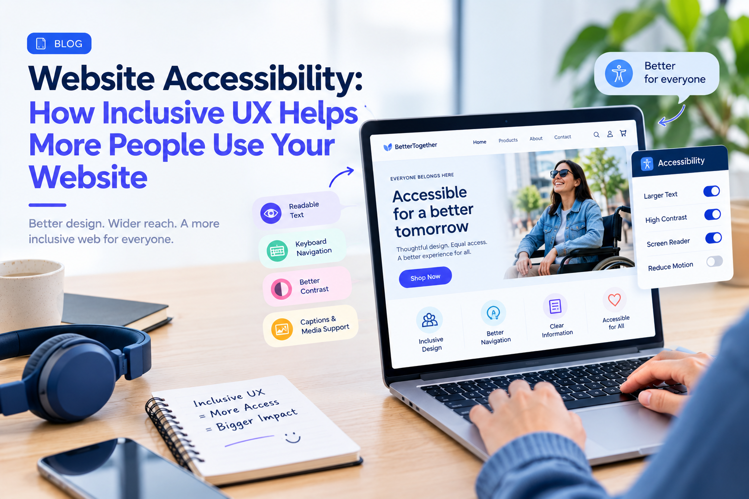
- Sufficient contrast
- Comfortable line spacing
- Clear heading hierarchy
- Readable font choices
- Responsive typography
Accessibility does not mean making every website look the same.
It means making information easier to consume.
2. Do Not Rely Only on Color
Color can help communicate information, but it should not be the only signal.
For example, a form should not indicate an error only by turning a field border red.
An accompanying message such as “Enter a valid email address” gives users additional context.
The same principle applies to charts, status indicators, links, and notifications.
Using text, icons, patterns, or other visual cues alongside color can make information easier to understand.
3. Design Buttons That Are Easy to Use
Buttons need to be recognizable and easy to interact with.
Very small tap targets can create problems, particularly on mobile devices.
Button labels should also communicate the action.
“Submit” may be acceptable in some situations, but “Create Account” or “Place Order” can provide more context.
Clear interaction design benefits both accessibility and general usability.
4. Make Keyboard Navigation Possible
Not every user navigates with a mouse or touchscreen.
Some rely on keyboards or other input devices.
Interactive elements should therefore be reachable and usable through keyboard navigation where appropriate.
Users should also be able to understand where they currently are on the page.
A visible focus state can provide important orientation.
5. Use Headings to Organize Content
Large blocks of text can become difficult to navigate.
Clear headings create structure.
A user should be able to scan the page and understand its organization without reading every paragraph.
This is particularly useful for people using screen readers, but it also helps users who quickly scan content on desktop and mobile devices.
Good information architecture is therefore closely connected to accessibility.
6. Write Helpful Form Errors
Forms are common sources of frustration.
An accessibility-friendly form should clearly identify errors and explain how to fix them.
Instead of:
“Invalid input.”
consider:
“Enter your 10-digit phone number.”
The message should appear close enough to the relevant field and should not rely entirely on color.
The objective is to help the user recover quickly.
7. Add Captions and Alternatives to Media
Videos can communicate information that is unavailable to users who cannot hear the audio.
Captions can make the content more accessible.
Images also need appropriate alternative text when they communicate meaningful information.
However, not every image needs a long description.
Decorative imagery can often be treated differently from images that communicate important information.
The key is understanding the purpose of the content.
8. Avoid Unnecessary Motion
Animations can make interfaces feel engaging, but excessive movement can create usability problems.
Large transitions, automatically moving content, flashing elements, or constantly changing interfaces can distract users.
Motion should support the experience rather than compete with it.
Where appropriate, interfaces can also respect users’ reduced-motion preferences.
9. Make Navigation Predictable
Users should not have to relearn how navigation works on every page.
Menus, links, buttons, and common interactions should behave consistently.
Predictability reduces cognitive effort.
This becomes particularly important for complex websites such as banking platforms, healthcare portals, enterprise applications, and e-commerce websites where users may already be dealing with complicated information.
10. Test With Real Users
Accessibility cannot be fully evaluated through visual inspection alone.
Automated accessibility tools can identify certain technical issues, but real-world testing is also valuable.
Teams can test important journeys such as:
Homepage → Search → Product → Form → Checkout
or:
Login → Dashboard → Account Settings → Confirmation
Testing different interaction methods can reveal problems that a standard design review misses.
Accessibility Is Part of Good UX
Accessibility should not be added at the end of a project.
When considered during UX research, information architecture, wireframing, visual design, and development, accessibility becomes part of the product rather than a last-minute correction.
It can also prevent expensive redesign work later.
Companies such as GeekyAnts work across UI/UX design and product engineering, where accessibility considerations can be incorporated alongside responsive design, product requirements, and technical implementation.
Inclusive Design Benefits More Than One Group
Accessibility is sometimes discussed as though it serves only a small group of users.
In reality, many accessibility improvements create broader usability benefits.
Captions help people watching videos without sound. Clear buttons help users on small screens. Good contrast helps people using devices outdoors. Simple navigation helps users who are unfamiliar with a website.
The result is a more flexible experience.
A More Accessible Website Starts With Better Questions
Instead of asking only:
“Does the website look good?”
UX teams can also ask:
“Can everyone understand this?”
“Can users complete the task without a mouse?”
“Can important information be understood without relying only on color?”
“Can users recover when something goes wrong?”
These questions shift accessibility from a checklist into part of the design process.
A truly effective website is not simply one that looks polished.
It is one that allows more people to understand, navigate, and complete their goals with confidence.