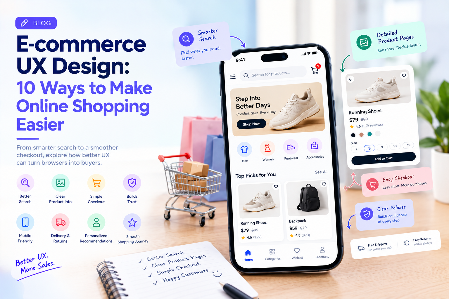
Online shoppers have more choices than ever. They can compare products, prices, reviews, delivery options, and brands within minutes.
That makes e-commerce UX design more important than simply making an online store look attractive.
A customer may discover a product through search, social media, an advertisement, or a recommendation. Once they arrive on the website, every step matters: finding the right product, understanding its price, checking availability, adding it to the cart, choosing delivery, and completing payment.
If any of these steps becomes unnecessarily difficult, the customer has plenty of alternatives.
Good e-commerce UX is therefore about reducing friction while helping customers make confident purchasing decisions.
1. Make Product Search Fast and Useful
Search is one of the most important features of an e-commerce website.
Customers rarely use exactly the same words a retailer uses internally. Someone looking for “running shoes” might search for “sports shoes,” “gym shoes,” or a specific brand and model.
A useful search experience should handle common variations and provide relevant suggestions.
Search filters should also help shoppers narrow results by factors such as price, size, brand, color, rating, availability, or other product-specific attributes.
The goal is simple: help customers reach the right products with fewer steps.
2. Do Not Overcomplicate Product Pages
A product page needs enough information to support a decision without overwhelming the customer.
Important information should be easy to identify:
- Product name
- Price
- Images
- Available options
- Product description
- Reviews
- Delivery information
- Return policy
- Add-to-cart action
The visual hierarchy should guide the customer toward the information they need rather than making every element compete for attention.
3. Use Product Images That Answer Questions
Online shoppers cannot physically inspect a product.
Images therefore need to do more than make the page attractive.
Multiple views, zoom functionality, product-in-use images, size references, and videos can help customers understand what they are buying.
For fashion and lifestyle products, showing products in realistic contexts can be particularly useful.
Visual content should support decision-making rather than simply fill space.
4. Make Pricing Completely Clear
Unexpected costs are a common source of friction during online shopping.
Customers should be able to understand the product price, applicable discounts, shipping charges, taxes where relevant, and final total.
If a promotion has conditions, those conditions should be explained clearly.
A customer who reaches checkout and discovers an unexpected charge may reconsider the purchase.
Transparent pricing builds confidence.
5. Simplify the Shopping Cart
The cart should make it easy to review an order before checkout.
Customers should be able to quickly change quantities, remove products, review prices, apply available discounts, and understand delivery information.
Avoid turning the cart into another promotional page filled with unrelated recommendations.
The primary purpose of the cart is to help customers confidently move toward checkout.
6. Reduce Checkout Friction
Checkout is one of the most important UX journeys in e-commerce.
Long forms, forced account creation, unclear payment steps, and unexpected information requests can create unnecessary friction.
Where appropriate, businesses can simplify checkout with guest purchasing, saved information, address suggestions, digital wallets, and clear progress indicators.
Every field should have a reason.
If the business does not need a piece of information to complete the transaction, asking for it may not be worth the additional friction.
7. Design for Mobile Shopping
E-commerce UX cannot be designed around desktop screens alone.
Customers increasingly browse and purchase through smartphones.
Mobile interfaces need comfortable tap targets, readable text, accessible filters, clear product images, easy scrolling, and simple checkout interactions.
The mobile experience should not simply be a smaller version of the desktop website.
It should be designed around how people actually use their phones.
8. Make Returns and Delivery Easy to Understand
Customers want to know when their order will arrive and what happens if they need to return it.
Delivery estimates, shipping options, return windows, and eligibility should be easy to locate.
Hiding this information can create uncertainty at exactly the point when customers are deciding whether to purchase.
Good UX answers practical questions before customers have to contact support.
9. Use Personalization Without Overwhelming Customers
Personalized recommendations can make product discovery easier.
An e-commerce site might highlight recently viewed products, relevant categories, frequently purchased items, or products related to a customer’s interests.
But personalization should remain useful.
Showing too many recommendations can make the interface feel crowded and distract customers from their original task.
The best personalization reduces search effort.
10. Build Trust Into the Interface
Customers need confidence before they provide payment information or place an order.
Trust signals can include clear product information, genuine reviews, transparent policies, recognizable payment options, contact details, security information, and consistent design.
Trust is not a separate page.
It is built throughout the customer journey.
How to Find E-commerce UX Problems
Businesses should not rely only on design reviews.
Analytics can reveal where customers abandon product pages, carts, or checkout. Search data can show what customers are struggling to find. Session recordings and usability testing can reveal where people hesitate.
Customer-support questions are also useful.
If customers repeatedly ask where to find delivery information or how to return a product, that may indicate a UX problem rather than simply a documentation problem.
Good E-commerce UX Is About Removing Unnecessary Decisions
A strong online shopping experience does not force customers to think about how the website works.
It helps them answer practical questions quickly:
What is this product?
Is it right for me?
How much does it cost?
When will I receive it?
Can I return it?
How do I buy it?
The easier those questions are to answer, the smoother the purchase journey becomes.
Companies such as GeekyAnts work across UI/UX design and digital product engineering, where e-commerce experiences can be designed alongside the underlying technology, integrations, and business requirements.
Ultimately, good e-commerce UX is not about adding more animations, pop-ups, or features.
It is about making the path from product discovery to purchase feel simple, trustworthy, and predictable.