


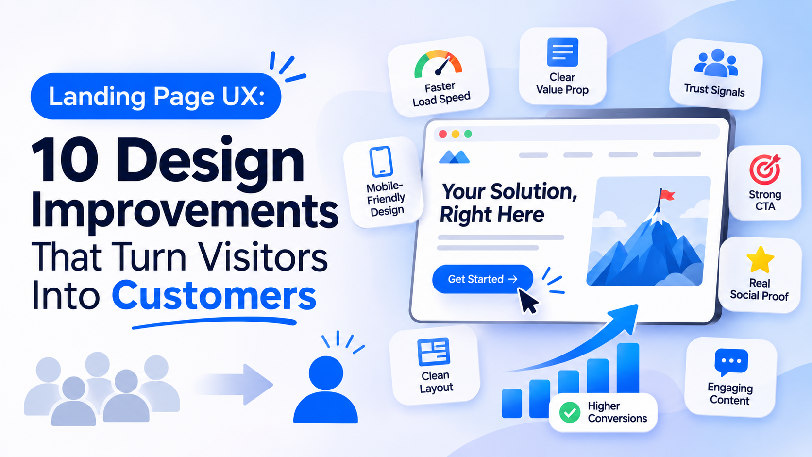
A landing page may be the first meaningful interaction someone has with a business. A visitor arrives after clicking an advertisement, searching Google, reading a blog, or following a social media link. Within seconds, they begin deciding whether the page offers what they need.
If the message is unclear, the layout feels overwhelming, or the next step is difficult to find, visitors may leave without taking action.
This is why landing page UX design matters. It connects visual design, content, navigation, and user behavior to create an experience that helps visitors understand an offer and decide what to do next.
A successful landing page does not need dozens of animations or complicated layouts. It needs to communicate value clearly and remove unnecessary friction.
1. Communicate the Value Proposition Immediately
Visitors should understand what a business offers without having to scroll through the entire page.
The headline should explain the main benefit in straightforward language. A supporting sentence can add context by identifying the audience, problem, or outcome.
For example, a generic headline such as “The Future of Business Technology” tells visitors very little.
A more useful headline might be:
“Manage Your Business Projects, Teams, and Deadlines in One Place.”
The second version explains what the product does and why someone might use it.
2. Create a Clear Visual Hierarchy
A landing page contains multiple elements competing for attention: headlines, images, benefits, testimonials, forms, and calls to action.
Visual hierarchy helps visitors understand which information matters most.
Designers can establish hierarchy through:
- Headline size and placement
- Spacing between sections
- Contrast
- Consistent typography
- Image positioning
- Button prominence
The primary message should stand out without making the rest of the page difficult to read.
3. Make the Primary CTA Obvious
A call to action (CTA) tells visitors what they can do next.
Examples include:
- Start Free Trial
- Book a Demo
- Get a Quote
- Download the Guide
- Create an Account
The CTA should describe the action rather than rely on vague labels such as “Click Here.”
Its placement also matters. Visitors should encounter a relevant action after understanding the offer, and longer pages can repeat the CTA where it makes sense.
However, too many competing buttons can make the decision harder.
4. Design for Mobile First
A landing page that looks excellent on a desktop can become difficult to use on a smartphone.
Text may become too small, buttons may be difficult to tap, and important content may get pushed too far down the screen.
A mobile-friendly landing page should include readable typography, responsive layouts, comfortable touch targets, optimized images, and simple forms.
Designers should test the actual mobile experience rather than assuming that a responsive layout automatically provides good usability.
5. Use Images That Explain the Offer
Images should help visitors understand the product or service.
For a software product, a genuine interface screenshot may be more useful than a generic stock photograph. For a physical product, clear product photography can help visitors evaluate details.
Useful visual content can include:
- Product screenshots
- Short demonstrations
- Before-and-after comparisons
- Process illustrations
- Customer use cases
- Relevant photography
Decorative visuals should not distract from the page’s main purpose.
6. Reduce Form Friction
Forms are often where visitors abandon a landing page.
Asking for too much information can discourage people who are interested but not ready to share extensive details.
A form should request only what the business needs at that stage.
For example, a demo request might initially need a name, work email, and company name. Additional questions can be collected later if necessary.
Clear field labels, useful validation, and helpful error messages also make forms easier to complete.
7. Build Trust With Relevant Proof
Visitors may not know the business or product. They need reasons to feel confident before sharing information or making a purchase.
Trust elements can include:
- Customer testimonials
- Case studies
- Verified reviews
- Client logos, where permitted
- Security information
- Transparent pricing
- Clear contact details
The proof should be relevant to the offer. A detailed customer example can be more persuasive than a large collection of generic claims.
8. Make the Content Easy to Scan
Most visitors do not read every sentence on a landing page.
They scan headings, short paragraphs, highlighted benefits, and visual elements to decide whether the page is relevant.
Use descriptive section headings, concise explanations, meaningful lists, and enough spacing to separate ideas.
Avoid filling the page with marketing language that repeats the same benefit in different words.
9. Improve Page Speed and Responsiveness
A slow landing page can interrupt the experience before visitors even see the offer.
Common areas to review include:
- Oversized images
- Unnecessary scripts
- Heavy animations
- Third-party widgets
- Unoptimized fonts
- Slow server responses
Teams should monitor real-world performance using tools such as Google’s PageSpeed Insights and Core Web Vitals reports.
Performance should be tested across different devices and network conditions, not just on a fast office connection.
10. Keep the User Journey Consistent
The landing page should match the promise that brought the visitor there.
If an advertisement promotes a free consultation, the landing page should make that consultation easy to understand and request. If a search result promises a pricing guide, visitors should be able to find the guide without navigating through unrelated content.
A mismatch between the original message and the landing page creates confusion and weakens trust.
How to Measure Landing Page UX
A landing page should be evaluated using more than its visual appearance.
Useful measurements include:
Conversion rate: The percentage of visitors who complete the intended action.
Form completion rate: How many visitors who begin a form successfully submit it.
CTA engagement: Whether visitors interact with the primary action.
Scroll depth: How far visitors move down the page.
Exit and abandonment patterns: Where visitors leave the experience.
Page performance: How quickly the page loads and responds.
Analytics should be combined with usability testing, user feedback, and session analysis. A high bounce rate alone does not always mean a page has poor UX; the visitor may have found exactly what they needed.
Landing Page UX and Conversion Rate Optimization
UX improvements and conversion rate optimization (CRO) work best together.
Teams can form a hypothesis, make a focused change, and measure its effect.
For example, if visitors are not completing a demo request, the issue may be an unclear value proposition, a lengthy form, or a lack of trust.
Testing a simpler form or a more descriptive CTA can help identify what improves the experience.
It is important to test meaningful changes rather than redesigning everything at once without understanding the underlying problem.
Common Landing Page UX Mistakes
Some issues repeatedly make landing pages harder to use:
- Multiple competing primary CTAs
- Vague headlines
- Too many form fields
- Autoplay media that distracts visitors
- Pop-ups that appear before visitors understand the offer
- Poor mobile spacing
- Hidden pricing or unclear conditions
- Generic testimonials without useful context
Fixing these problems can be more valuable than adding another visual effect or decorative section.
Final Thoughts
Effective landing page UX is about helping visitors make informed decisions.
A clear value proposition, useful visuals, readable content, simple forms, credible proof, and fast performance all contribute to a stronger experience.
Businesses should treat landing pages as part of the complete customer journey, not isolated marketing assets.
Companies such as GeekyAnts work across UI/UX design and product engineering, where landing page experiences can be connected with broader digital products, customer journeys, and business goals.
Ultimately, the best landing page is not necessarily the most visually complicated. It is the one that helps the right visitor understand the offer and take the next step with confidence.