

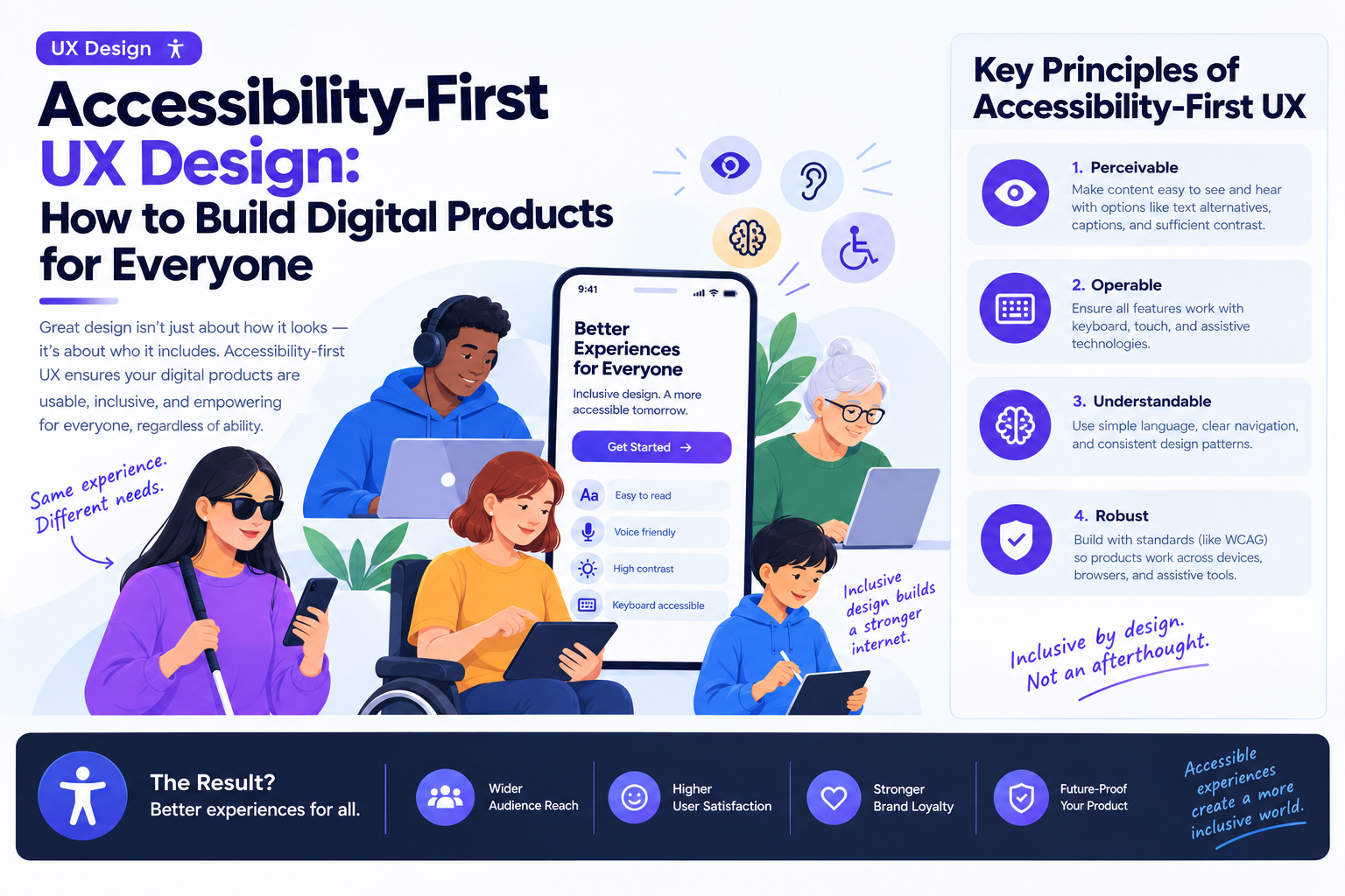
A digital product can look polished and still be difficult for people to use. Small text, low color contrast, confusing navigation, and forms that depend entirely on a mouse can prevent users from completing even simple tasks.
Accessibility-first UX design addresses these barriers by considering different user needs from the beginning of the design process rather than treating accessibility as a final compliance check.
For businesses, this approach can improve usability across a wider audience, reduce avoidable friction, and create more consistent digital experiences across devices and assistive technologies.
What Is Accessibility-First UX Design?
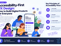
Accessibility-first UX design means planning and designing digital experiences so that people with different abilities can perceive, understand, navigate, and interact with them.
It considers users who may have visual, auditory, motor, cognitive, or situational limitations. For example, someone using a screen reader needs meaningful labels, while someone navigating with a keyboard needs a clear focus indicator and a logical tab order.
Accessibility also benefits users in temporary or environmental situations, such as someone using a phone in bright sunlight or navigating an interface with one hand.
Five Accessibility Practices UX Teams Should Prioritize
1. Make Content Easy to Read
Typography, spacing, and contrast affect how comfortably users consume information.
Designers should use readable font sizes, maintain sufficient contrast between text and backgrounds, and avoid relying on color alone to communicate important information. Error messages, status indicators, and instructions should remain understandable without visual cues alone.
2. Design for Keyboard Navigation
Every essential interaction should work without requiring a mouse. This includes navigation menus, dialogs, forms, dropdowns, and interactive controls.
Visible keyboard focus helps users understand where they are on the page. Logical focus order also prevents people from becoming trapped in an interaction or skipping important content.
3. Use Clear Labels and Helpful Error Messages
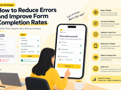
Forms are a common source of accessibility problems. Unclear field labels, unexplained validation errors, and instructions that disappear when users start typing can make completion difficult.
Use persistent labels, explain what information is required, and provide specific recovery guidance. Instead of displaying “Invalid input,” explain what needs to change and how the user can fix it.
4. Support Screen Readers and Assistive Technologies
Semantic HTML, descriptive link text, appropriate heading structures, and meaningful alternative text help assistive technologies communicate page content.
Designers should collaborate with developers to ensure that interactive elements expose their purpose and state correctly. Automated testing can identify some issues, but manual checks with keyboards and screen readers remain important.
5. Avoid Unnecessary Motion and Time Pressure
Animations, flashing content, auto-playing media, and short session timeouts can create barriers for some users.
Provide controls for pausing moving content where appropriate, respect reduced-motion preferences, and give users enough time to complete important tasks.
How to Integrate Accessibility Into the UX Workflow
Accessibility works best when it is part of the entire product lifecycle.
- Research: Include people with varied abilities and interaction preferences in user research.
- Wireframing: Define heading structure, reading order, keyboard flow, and content hierarchy early.
- Prototyping: Test focus states, error handling, zoom behavior, and alternative interaction paths.
- Development: Use semantic components and established accessibility patterns.
- Quality assurance: Combine automated scans, keyboard testing, screen-reader checks, and usability testing.
- Maintenance: Reassess accessibility whenever components, content, or product workflows change.
Teams can use the Web Content Accessibility Guidelines (WCAG) as a practical reference for evaluating digital experiences. The appropriate conformance target should be determined by the product’s audience, applicable regulations, and business requirements.
Common Accessibility Mistakes to Avoid
A few recurring mistakes can undermine otherwise strong UX work:
- Treating accessibility as a checklist completed only before launch.
- Using color as the only indicator of success, failure, or urgency.
- Adding generic alternative text that does not describe an image’s purpose.
- Removing keyboard focus indicators for visual reasons.
- Assuming automated testing alone proves a product is accessible.
- Making accessibility improvements without validating them with real users.
Avoiding these issues requires collaboration between designers, engineers, content specialists, and QA teams.
Measuring the Impact of Accessible UX
Accessibility improvements can be evaluated through both technical checks and user behavior. Teams may monitor keyboard task completion, form error rates, abandonment rates, support requests, and usability feedback from participants with disabilities.
These measures should be interpreted in context. A reduction in form abandonment, for example, may reflect clearer instructions or a better overall workflow rather than accessibility changes alone.
Conclusion
Accessibility-first UX design is a practical way to make digital products more usable, resilient, and inclusive. By incorporating accessibility into research, interface design, development, and testing, product teams can identify barriers earlier and avoid expensive redesigns later.
The strongest approach is to treat accessibility as an ongoing product quality responsibility—not a final audit. Digital experiences become more effective when more people can use them confidently and independently.