

A digital product can be visually attractive, technically advanced, and highly optimized while still creating a frustrating experience for users.
Sometimes the problem is not the interface itself but the way design decisions influence user behavior.
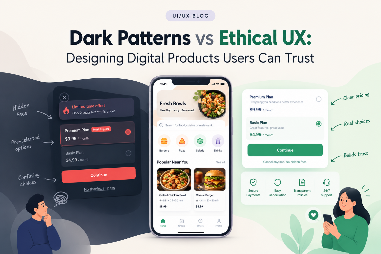
An interface that makes it difficult to cancel a subscription, hides important pricing information, or uses confusing buttons can push users toward actions they did not intentionally choose.
These patterns are commonly discussed as dark patterns.
Ethical UX takes a different approach.
Instead of optimizing interfaces purely for clicks or conversions, it focuses on creating experiences where users understand their choices and can make decisions without unnecessary manipulation.
What Are Dark Patterns?
Dark patterns are interface techniques that can influence users into taking actions they may not have intended.
Examples can include:
- Confusing cancellation flows
- Hidden fees
- Misleading buttons
- Preselected options
- Difficult-to-find privacy controls
- Disguised advertisements
- Complicated unsubscribe processes
- Unclear subscription terms
The issue is not persuasion itself.
Digital products naturally encourage users to take actions such as purchasing a product, creating an account, or upgrading a plan.
The concern arises when the interface intentionally makes alternatives difficult to understand or access.
Why Ethical UX Matters
Users build trust through repeated interactions.
If a product consistently communicates clearly, users know what to expect.
If the same product repeatedly surprises users with unexpected charges, confusing settings, or difficult cancellation processes, confidence can decline.
Ethical UX therefore considers both:
What does the business want the user to do?
and
Does the user understand what they are agreeing to?
1. Make Pricing Clear
Pricing should be understandable before a user commits.
If additional charges apply, they should not be intentionally hidden until the final step.
A good interface can clearly communicate:
- Product price
- Taxes
- Service charges
- Subscription cost
- Billing frequency
- Applicable discounts
Clear pricing helps users make informed decisions.
2. Make Cancellation Straightforward
If subscribing takes two clicks but cancellation requires several unrelated screens, the experience creates unnecessary friction.
A transparent subscription experience should make it reasonably easy for users to understand how to manage or cancel their plans.
The goal is not to prevent cancellation.
The goal is to provide enough value that users choose to stay.
3. Avoid Misleading Buttons
Button labels should accurately describe what happens when users select them.
For example:
Start Free Trial
should clearly communicate whether payment information is required and when billing begins.
A button should not make one option visually obvious while hiding another important choice through ambiguous language.
4. Give Users Real Choices
Consent and preference interfaces should provide meaningful choices.
For example, privacy settings should not make acceptance obvious while making other options difficult to locate.
Users should be able to understand the implications of their choices.
This is especially important for products that collect personal information.
5. Design Better Permission Requests
Mobile and web products frequently request access to:
- Location
- Camera
- Microphone
- Contacts
- Notifications
- Photos
A permission request is more useful when the product explains why access is needed.
For example:
“Allow location access to show delivery options near you.”
This gives the user context instead of presenting an unexplained request.
6. Don’t Hide Important Information
Important information should not be buried inside tiny text or obscure interactions.
Users may need to know:
- Subscription terms
- Return policies
- Data usage
- Delivery charges
- Cancellation conditions
- Product limitations
The interface should make relevant information discoverable at the moment users need it.
7. Use Confirmation for High-Impact Actions
Some actions deserve additional confirmation.
Deleting an account, making a large purchase, removing important data, or changing security settings can have significant consequences.
A confirmation step can clearly explain:
What will happen?
Can the action be reversed?
What will the user lose?
This is more useful than a generic “Are you sure?” message.
Ethical UX Does Not Mean Weak UX
Ethical design does not mean removing calls to action or avoiding business goals.
A product can still encourage users to:
- Upgrade
- Purchase
- Subscribe
- Share
- Book
- Create an account
The difference is transparency.
A well-designed product can communicate value clearly without making alternatives confusing.
Measure More Than Conversion Rate
Conversion is an important business metric, but it should not be the only measure of UX quality.
Teams can also examine:
- Customer retention
- Cancellation rates
- Support requests
- Refund requests
- Complaints
- Task completion
- User satisfaction
- Repeat usage
A design that increases short-term conversions but creates more complaints or cancellations may require a broader evaluation.
Ethical UX and Accessibility
Clear design often benefits accessibility too.
Readable language, understandable controls, predictable navigation, clear errors, and visible choices can help a wider range of users interact with a product.
Ethical UX therefore overlaps with accessibility, usability, privacy, and inclusive design.
Build Trust Into the Design Process
Ethical UX should not be treated as a final checklist.
Design teams can discuss trust during:
Research → User Flows → Wireframes → Prototypes → Testing → Development
Usability testing can reveal whether users misunderstand pricing, permissions, cancellation options, or important actions.
That feedback can be used before the product reaches production.
UX Designers and Business Goals
A strong UX process considers both user needs and business objectives.
For example, a subscription company may want to increase upgrades.
Instead of hiding the free option, the product can explain the additional value available through the paid plan.
Instead of making cancellation difficult, the product can understand why customers leave and improve the service.
This approach can connect business growth with a healthier customer relationship.
Final Thoughts
Good UX is not simply about making interfaces attractive.
It is about helping people understand what is happening and giving them enough control to make informed decisions.
Ethical UX can create clearer pricing, more understandable permissions, better cancellation flows, and more transparent interactions.
Companies such as GeekyAnts work across UI/UX design and product engineering, where user experience decisions can be considered alongside product strategy, technology, accessibility, and implementation.
The strongest digital products do not need to manipulate users into completing an action.
They make the value clear, make the choices understandable, and let the experience speak for itself.