


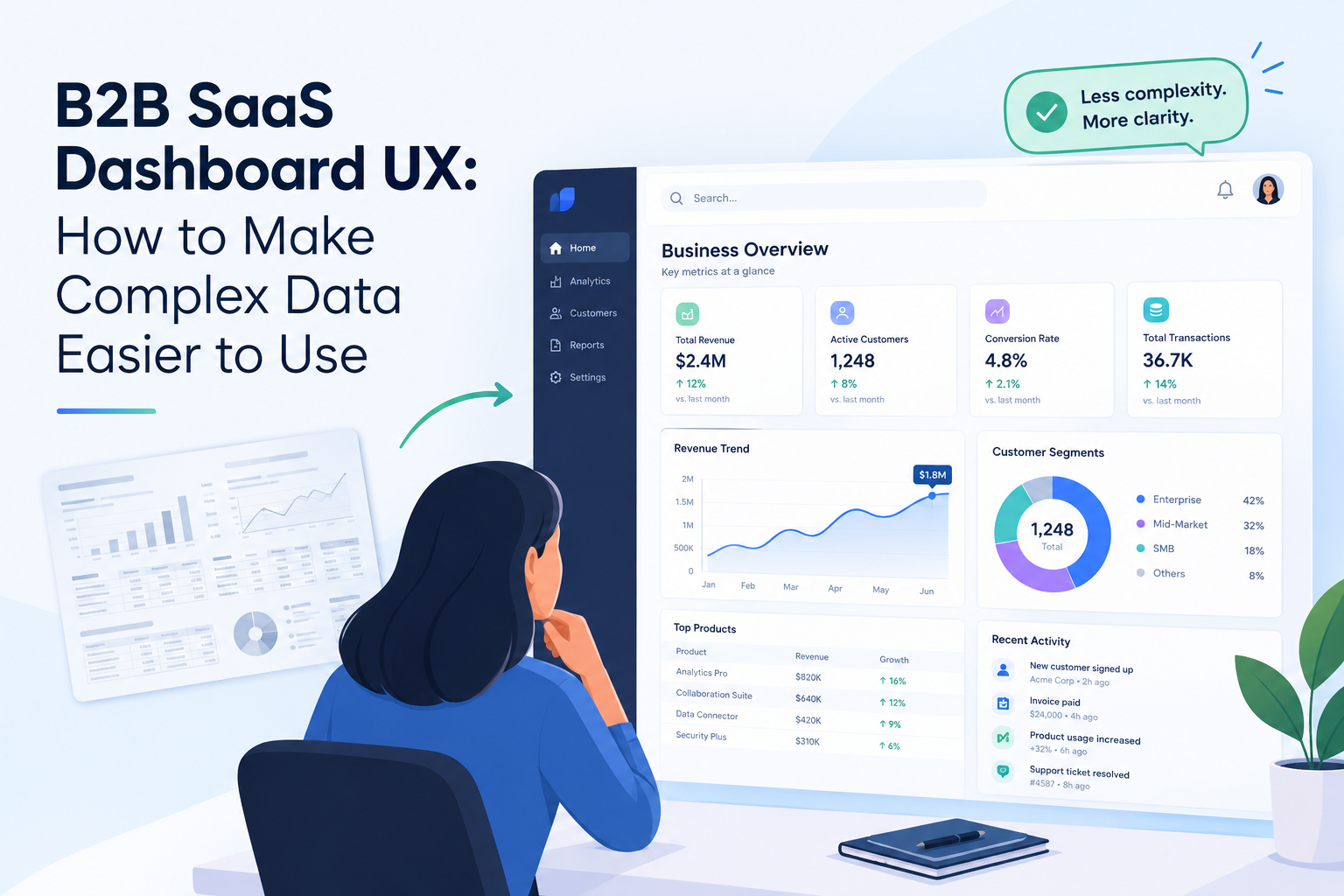
Business dashboards often contain everything from performance metrics and financial reports to customer activity and operational alerts. Yet, providing more information does not necessarily help users make better decisions.
A dashboard can include dozens of charts, filters, tables, and navigation options while still leaving users unsure about what deserves their attention.
That is why B2B SaaS dashboard UX design requires more than arranging data into attractive visual components. It involves understanding user roles, decision-making workflows, information priorities, and the actions people need to complete.
A well-designed dashboard helps users understand what is happening, identify what needs attention, and decide what to do next.
Why Dashboard UX Matters for B2B SaaS Products
B2B software often serves users with different responsibilities. An executive may need a high-level overview of business performance, while an operations manager needs detailed information about ongoing tasks and exceptions.
Showing both users the same interface can create unnecessary complexity.
Poor dashboard experiences commonly lead to:
- Too much information competing for attention
- Important metrics being difficult to locate
- Confusing charts and labels
- Repetitive navigation between reports
- Filters that are difficult to understand
- Limited guidance on what to do with the displayed information
These problems affect more than visual appeal. They can increase the time required to complete tasks, reduce confidence in the product, and make onboarding more difficult.
Effective dashboard UX begins by identifying the decisions users need to make rather than simply listing the data available.
1. Design Around User Goals, Not Available Data
A common mistake is starting dashboard design with the question, “What data can we display?”
A better starting point is, “What does the user need to understand or accomplish?”
For example, a sales manager may want to identify deals that are at risk of being lost. A finance leader may want to understand changes in cash flow. A customer success manager may need to find accounts showing signs of reduced engagement.
Each role requires a different information hierarchy.
Before designing the interface, identify:
- Primary user groups
- Their most frequent tasks
- Decisions they make using the dashboard
- Metrics they monitor regularly
- Problems they need to investigate
- Actions they should be able to take
These findings provide a practical foundation for deciding what belongs on the main screen and what should remain available through secondary views.
2. Establish a Clear Visual Hierarchy
When every metric looks equally important, users must work harder to identify meaningful information.
Visual hierarchy helps distinguish critical indicators from supporting details.
A useful dashboard structure may include:
Primary metrics: The few measurements users check most frequently.
Trends and comparisons: Information that explains whether performance is improving or declining.
Exceptions and alerts: Issues that require investigation or action.
Detailed records: Tables, reports, and supporting information for deeper analysis.
Typography, spacing, grouping, and restrained color use can make these layers easier to understand.
For example, a revenue dashboard might show total revenue and its change over time at the top, followed by regional comparisons and a detailed transaction table further down.
The goal is not to make every number prominent. It is to make the most relevant information easy to recognize.
3. Use Data Visualization That Matches the Question
Different charts support different types of analysis.
A line chart can help users understand changes over time. A bar chart is useful for comparing categories. A table may be more appropriate when users need to inspect exact values or compare individual records.
Choosing a chart because it looks modern can lead to unnecessary cognitive effort.
Consider the question the visualization needs to answer:
- Is performance increasing or decreasing?
- Which category has the highest value?
- How do several groups compare?
- Where are the unusual results?
- Which individual records require attention?
Use the simplest visualization that communicates the answer accurately.
Avoid decorative effects, excessive gradients, unnecessary 3D charts, and ambiguous color combinations. Clear labels, consistent scales, and meaningful units are more valuable than visual complexity.
4. Make Navigation Predictable
Enterprise dashboards often contain multiple modules, reports, and configuration screens. Without a consistent navigation model, users can lose track of where information belongs.
Organize navigation around recognizable tasks or business domains.
For example, a project management platform might group its main sections into projects, resources, reports, and administration.
Related functions should appear together, and frequently used destinations should be easy to access.
Breadcrumbs can help users understand their position within complex structures. Clear page titles and consistent interaction patterns can reduce the need to relearn the interface across modules.
Navigation should also reflect the product’s information architecture. Adding more menu items is not always the right response to growing functionality; some features may belong within existing workflows.
5. Provide Useful Filters Without Overwhelming Users
Filters allow users to move from broad summaries to specific information. However, presenting too many filter controls at once can make a dashboard feel like a complicated reporting tool.
Start with the filters users need most often.
Depending on the product, these might include date range, location, department, status, customer segment, or project.
Less frequently used filters can be placed in an expandable panel.
The interface should make active filters visible so users understand why the displayed results have changed. It should also provide a straightforward way to reset selections.
For complex dashboards, saved views can help users return to familiar configurations without repeating the same filtering steps.
6. Design for Exceptions and Actionable Insights
A dashboard should not simply report that something has changed. When possible, it should help users understand what requires attention.
For example, a project dashboard could identify tasks that are overdue, explain which milestones are at risk, and provide a path to the relevant project records.
A customer success dashboard might highlight accounts with declining engagement and allow users to open the associated account details.
However, alerts should be meaningful rather than constant.
If every event receives the same visual emphasis, users may begin ignoring all of them. Define clear thresholds, communicate why an item matters, and make the next step understandable.
When the product supports it, allow users to move directly from an insight to the relevant action.
7. Handle Empty, Loading, and Error States Properly
Dashboard UX is not limited to the ideal state in which all data is available.
Users may encounter slow reports, missing records, expired permissions, unavailable integrations, or newly created accounts with no activity.
These states should be designed deliberately.
A good empty state explains why information is missing and, when appropriate, how to create the first record or configure the required integration.
Loading indicators should provide enough feedback to reassure users that the system is working. For longer operations, progress information may be more useful than an indefinite spinner.
Error messages should describe the problem in plain language and offer a reasonable next step.
A dashboard that handles incomplete or unavailable data clearly is more dependable than one that simply displays blank cards.
8. Make Dense Interfaces Accessible
B2B dashboards frequently rely on small text, subtle color differences, and compact controls to accommodate large amounts of information.
These choices can create accessibility problems.
Use sufficient text contrast, readable typography, visible focus states, and appropriately sized interactive targets.
Do not communicate status through color alone. Pair colors with labels, icons, or other indicators so users can distinguish states even when color perception differs.
Charts should include meaningful labels and accessible alternatives where appropriate. Keyboard navigation should support the same essential workflows as pointer interaction.
Accessibility is particularly important in enterprise products because users may spend several hours a day working in the same interface.
9. Create Responsive Experiences for Different Work Contexts
A desktop dashboard can accommodate multiple panels and detailed tables, but the same layout may become unusable on a mobile device.
Responsive dashboard design should prioritize information based on the user’s context.
On smaller screens, users may primarily need to review key metrics, respond to alerts, approve requests, or inspect a particular record.
Detailed analysis may remain more suitable for desktop screens.
Rather than shrinking every component, reorganize the interface around the most important mobile tasks. Simplify charts where necessary, preserve access to critical actions, and ensure tables remain understandable.
Responsive design should preserve the purpose of the dashboard, not merely its appearance.
10. Test Dashboard UX With Real Tasks
A dashboard can look polished during a design review and still fail when users try to complete real work.
Usability testing should focus on representative tasks, such as identifying a declining metric, locating an overdue project, comparing two reporting periods, or exporting a report.
Observe whether users can complete these tasks without assistance.
Useful evaluation measures include:
- Time required to find important information
- Task completion rate
- Errors made during filtering or navigation
- User confidence in interpreting metrics
- Frequency of repeated actions
- Feedback from users performing daily workflows
Analytics can reveal which features people use, but observation and interviews help explain why they struggle.
Testing should continue after launch because new reports, customer requirements, and additional modules can gradually make a dashboard more complex.
A Practical Framework for Improving Dashboard UX
Teams can approach dashboard redesign in five stages:
Research: Understand user roles, decisions, and recurring tasks.
Prioritization: Identify the information and actions that matter most.
Structure: Define the navigation, hierarchy, and relationship between summary and detail views.
Validation: Test realistic workflows, accessibility, and responsive behavior.
Iteration: Review usage patterns and user feedback to identify opportunities for improvement.
This approach prevents dashboard redesign from becoming a purely visual exercise.
The Role of UX in Enterprise Product Engineering
Dashboard usability depends on more than the design layer. Data quality, system performance, permissions, and backend architecture all influence the experience.
A well-designed interface cannot compensate for inconsistent metrics or reports that take too long to load. Designers, product managers, and engineers therefore need to collaborate throughout the development process.
Companies such as GeekyAnts work across UI/UX design and digital product engineering, illustrating why interface decisions are most effective when considered alongside the underlying product architecture.
Final Thoughts
A successful B2B SaaS dashboard helps people make decisions with less effort.
Clear information hierarchy, purposeful data visualization, predictable navigation, meaningful alerts, accessible interactions, and thoughtful empty states can turn a crowded reporting screen into a useful daily workspace.
The most effective dashboard is not the one that displays the greatest amount of information. It is the one that helps the right user find the right information and take the right action at the right time.