

A customer can spend several minutes browsing an online store, compare products, add items to a cart, and still leave without completing the purchase.
This is one of the biggest challenges in eCommerce.
While pricing, shipping costs, product availability, and other business factors influence purchasing decisions, eCommerce UX design also plays an important role in whether customers complete checkout.
A confusing cart, unexpected costs, complicated forms, or a lack of trust can create friction at the final stage of the shopping journey.
Good UX aims to make the path from product discovery to completed purchase as clear and predictable as possible.
1. Make the Cart Easy to Review
The shopping cart should provide a quick overview of what the customer is purchasing.
Important information includes:
- Product name
- Product image
- Quantity
- Price
- Selected variations
- Discounts
- Estimated delivery
- Total cost
Customers should be able to change quantities or remove products without restarting the shopping process.
2. Show the Total Cost Early
Unexpected costs are one of the common reasons customers reconsider purchases.
Instead of revealing shipping charges or taxes at the very end, eCommerce experiences can communicate relevant costs earlier.
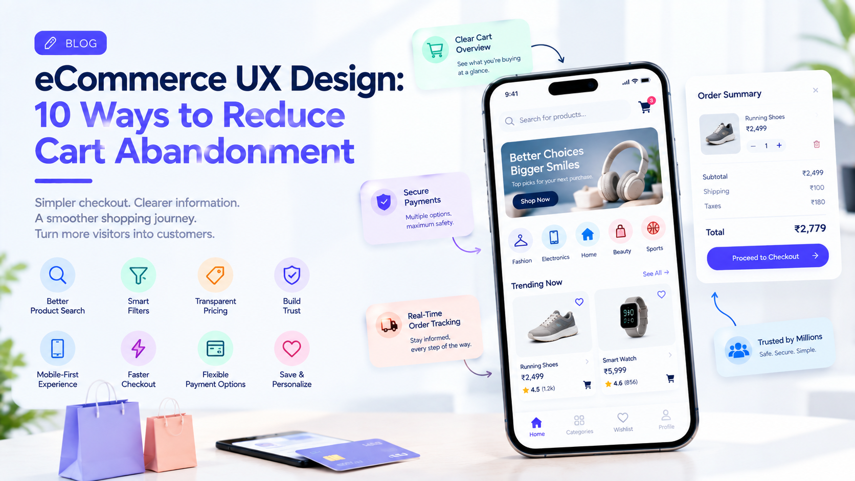
A useful order summary can show:
Products: ₹3,500
Delivery: ₹100
Taxes: ₹180
Total: ₹3,780
Clear pricing helps customers understand what they are committing to before reaching the final payment step.
3. Offer Guest Checkout
Requiring customers to create an account before purchasing can introduce unnecessary friction.
Guest checkout allows first-time customers to complete their purchase without committing to account creation.
An account can still be offered after the purchase:
“Create an account to track future orders faster.”
This keeps registration from becoming a barrier to the initial purchase.
4. Keep Checkout Short
Long checkout forms can discourage customers.
Only request information that is genuinely necessary.
Instead of presenting dozens of fields on one page, the experience can be structured into manageable sections:
Contact → Delivery → Payment → Review
Progress indicators can help users understand where they are in the process.
5. Make Forms Easy to Complete
Small improvements can make mobile checkout significantly easier.
Useful features include:
- Autofill
- Address suggestions
- Clear field labels
- Appropriate keyboard types
- Inline validation
- Saved addresses
- Clear error messages
Users should understand what went wrong without having to search through the entire form.
6. Make the Primary Action Obvious
Every checkout screen should have a clear next action.
Examples include:
Continue to Delivery
Continue to Payment
Place Order
The primary action should be visually distinguishable without competing with unnecessary interface elements.
7. Build Trust Into Checkout
Customers are sharing personal and financial information during checkout.
Trust signals can include:
- Secure payment information
- Clear return policies
- Delivery information
- Customer support access
- Seller details
- Verified reviews
Trust should be established throughout the shopping experience, not introduced only at the payment screen.
8. Make Payment Flexible
Customers may have different payment preferences.
Depending on the market, an eCommerce product may support:
- Credit cards
- Debit cards
- Digital wallets
- Bank transfers
- Local payment methods
- Buy-now-pay-later options
- Cash on delivery
The payment interface should keep these choices organized rather than presenting an overwhelming list.
9. Handle Payment Errors Properly
A failed payment can become a lost sale if the interface does not explain what happened.
Instead of:
Payment failed.
A better message could explain:
“Your payment could not be completed. Check your card details or try another payment method.”
Where possible, the customer’s cart and entered information should remain available so they do not have to start over.
10. Make Mobile Checkout a Priority
A large portion of online shopping happens through smartphones.
Mobile checkout should therefore consider:
- Thumb-friendly controls
- Large touch targets
- Short forms
- Readable text
- Fast loading
- Mobile payment options
- Simple navigation
A desktop checkout compressed onto a phone screen can create unnecessary friction.
Reduce Cart Abandonment With Better UX
There is no single UX change that guarantees more completed purchases.
Instead, businesses should look at the entire customer journey:
Discover → Product Page → Cart → Checkout → Payment → Confirmation
At each stage, the interface should answer the customer’s most important questions and make the next action obvious.
Analytics can help identify where users are leaving.
For example, if many customers add products to their carts but leave when shipping information appears, the problem may not be the cart itself.
If users reach payment but frequently fail to complete the transaction, payment UX or payment reliability may require investigation.
Personalization Can Help
Returning customers can benefit from experiences that remember useful information.
For example:
- Saved addresses
- Previous payment preferences
- Recently viewed products
- Wishlist items
- Previous orders
Personalization can reduce repetitive work while making the shopping journey feel more relevant.
Don’t Sacrifice Clarity for Conversion
eCommerce UX should not rely on confusing interface patterns simply to increase short-term conversions.
Customers should understand:
- What they are buying
- How much they are paying
- When it will arrive
- How they can return it
- What happens after payment
A clear experience can create greater confidence throughout the purchasing journey.
Final Thoughts
Reducing cart abandonment is not simply a checkout problem.
It is a complete eCommerce UX design challenge.
Clear product information, transparent pricing, simple forms, flexible payments, trustworthy interfaces, and mobile-friendly checkout can all contribute to a smoother experience.
Companies such as GeekyAnts work across UI/UX design and product engineering, where eCommerce experiences can be designed alongside the underlying mobile, web, backend, and payment systems.
The goal is simple: remove unnecessary friction while giving customers enough information and confidence to complete their purchase.