


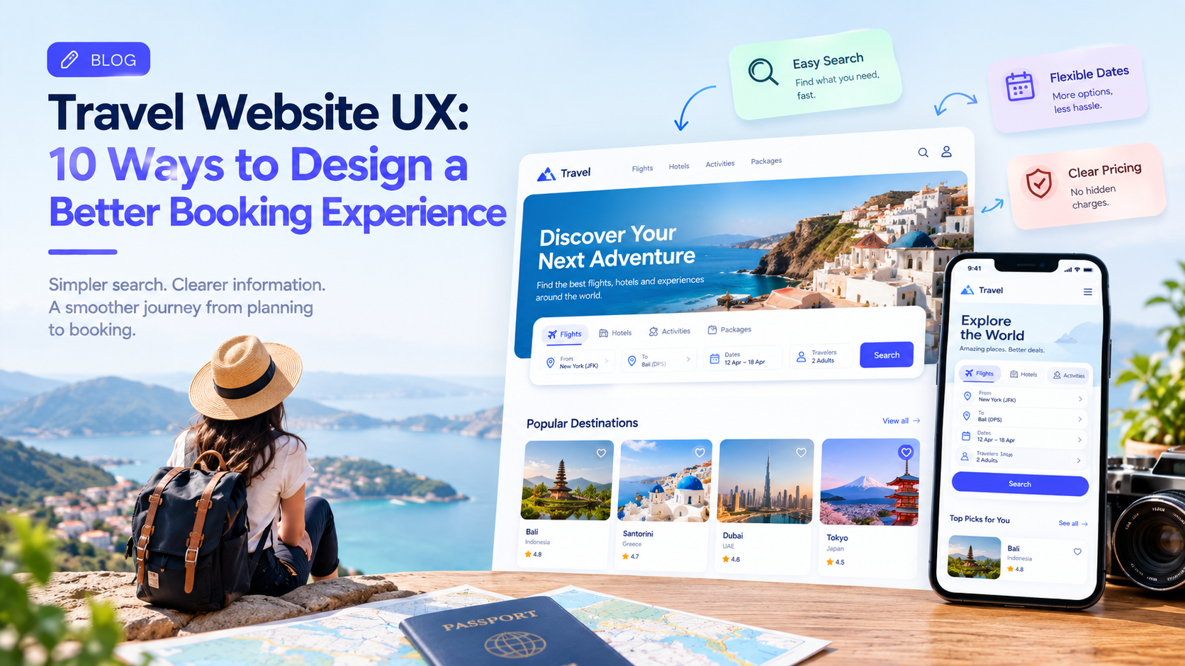
Planning a trip often involves comparing destinations, checking prices, reviewing hotels, choosing flights, and making several decisions before completing a booking.
A travel website can offer thousands of options, but too much information can make the experience harder rather than easier.
This is why travel website UX plays an important role in how quickly users can discover, compare, and book what they need.
A good travel experience should reduce uncertainty, make important information easy to find, and help users move from inspiration to booking without unnecessary friction.
1. Start With a Simple Search Experience
Travel websites often begin with a search box.
Users may want to search for:
- Flights
- Hotels
- Vacation rentals
- Activities
- Car rentals
- Travel packages
The search interface should make the primary task immediately obvious.
Instead of presenting too many options at once, the interface can guide users through destination, dates, travelers, and other relevant information.
The goal is to help users start planning without making the first interaction complicated.
2. Make Dates Easy to Select
Travel dates are central to most booking journeys.
A poorly designed date picker can quickly become frustrating.
A good calendar should make it easy to:
- Select departure and return dates
- Understand available dates
- Navigate between months
- Identify the selected range
- Correct a selection
For flexible travelers, options such as “Weekend,” “Next month,” or “Flexible dates” can also reduce the effort required to search.
3. Make Pricing Transparent
Price is one of the most important factors in travel decisions.
Users should not have to reach the final checkout screen to discover additional charges.
Travel interfaces can clearly distinguish between:
Base price
Taxes
Service fees
Additional charges
Total price
Transparent pricing helps users compare options more confidently.
4. Improve Search Filters
Travel websites can contain thousands of results.
Filters help users narrow them down.
Depending on the product, useful filters may include:
- Price
- Location
- Rating
- Amenities
- Property type
- Travel duration
- Departure time
- Number of stops
- Cancellation options
Filters should be easy to understand and easy to remove.
Users should also be able to see which filters are currently active.
5. Use Maps Where They Add Value
Location matters enormously in travel.
A hotel that looks inexpensive may be inconvenient if it is far from the places a traveler wants to visit.
A map view can help users understand:
- Distance
- Neighborhood
- Nearby attractions
- Transportation
- Hotels and properties
The map should complement the list of results rather than force users to switch constantly between different interfaces.
6. Make Hotel and Property Pages Scannable
Travelers often compare several properties before making a decision.
A property page should make important information easy to scan.
Useful information can include:
Price
Photos
Location
Ratings
Amenities
Room details
Cancellation policy
Availability
Long descriptions can still be useful, but critical information should not be buried inside large blocks of text.
7. Design for Mobile Travelers
Many travel decisions happen on smartphones.
Users may search while commuting, standing in an airport, or already traveling.
Mobile travel UX should therefore prioritize:
- Large touch targets
- Simple navigation
- Fast loading
- Clear booking actions
- Easy date selection
- Readable pricing
- Accessible maps
A mobile interface should not simply be a smaller version of the desktop website.
It needs to be designed around mobile behavior.
8. Reduce Booking Friction
Once a traveler has selected a flight, hotel, or activity, unnecessary steps can cause abandonment.
The booking flow should request only the information that is actually required.
Progress indicators can also help users understand how many steps remain.
For example:
Trip Details → Traveler Information → Payment → Confirmation
A clear structure makes a complex process feel more manageable.
9. Design Helpful Confirmation Screens
The booking confirmation should answer the user’s immediate questions.
For example:
Booking Confirmed
Hotel: Ocean View Resort
Dates: October 12–15
Guests: 2
Confirmation Number: XXXX
Check-in: 2:00 PM
The interface can also provide useful actions such as:
View Booking
Add to Calendar
Get Directions
Contact Property
The confirmation screen should feel like the beginning of the trip rather than simply the end of the payment process.
10. Build Trust Into the Experience
Travel purchases involve money and uncertainty.
Users may wonder:
- Can I cancel?
- Is the price final?
- Is the property legitimate?
- What happens if my flight changes?
- What is included?
UX should address these questions directly.
Clear policies, reviews, secure payment indicators, customer support access, and transparent pricing can help reduce uncertainty.
Personalization Can Improve Travel UX
Returning users may have different needs from first-time visitors.
A travel platform could potentially remember preferences such as:
- Preferred destinations
- Typical trip duration
- Favorite property types
- Previous searches
- Preferred departure airports
Personalization can reduce repetitive work.
But users should still be able to change or reset their preferences.
Travel UX Should Support the Entire Journey
A travel product does not stop being useful after payment.
The broader journey can include:
Discover → Search → Compare → Book → Prepare → Travel → Manage → Return
Each stage can create different UX requirements.
For example, after booking, users may need itinerary information, check-in reminders, travel updates, directions, or support.
Thinking beyond the booking screen can create a more complete travel experience.
Final Thoughts
Travel websites deal with complex decisions, large amounts of information, and high-value transactions.
Good UX makes that complexity easier to navigate.
The strongest travel experiences do not necessarily provide the most features.
They help users find the right option, understand the cost, feel confident about the decision, and complete the booking with minimal friction.
Companies such as GeekyAnts work across UI/UX design and product engineering, where travel experiences can be designed across websites, mobile applications, booking workflows, and supporting digital systems.