


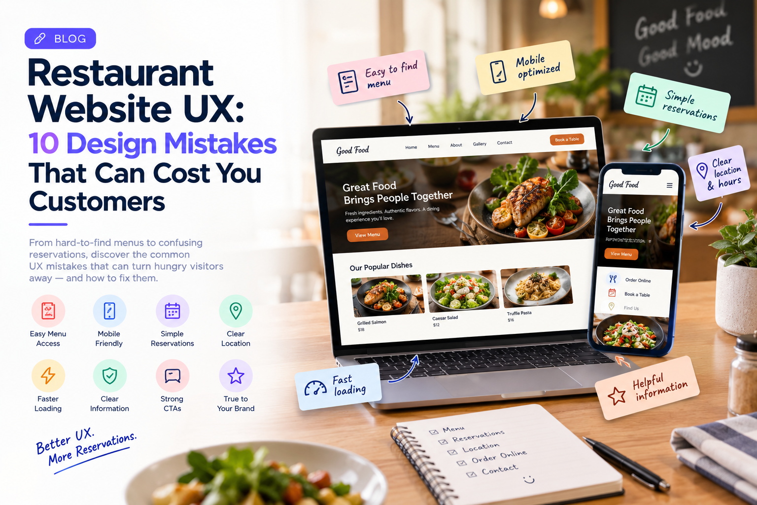
For a restaurant, a website is often the first place a potential customer goes before deciding where to eat.
They may be looking for a menu, checking opening hours, viewing photos, finding the location, making a reservation, or simply deciding whether the restaurant looks worth visiting.
If that information is difficult to find, the customer may leave and choose another restaurant.
This is why restaurant website UX matters.
A restaurant website does not need complicated functionality to create a good experience. It needs to make common tasks quick, clear, and convenient.
1. The Menu Is Difficult to Find
The menu is one of the most important pieces of information on a restaurant website.
Yet some websites hide it behind several navigation steps or provide it only as a downloadable PDF.
Customers often want to check prices, dishes, dietary options, and portion information before deciding whether to visit.
The menu should therefore be easy to find from the main navigation and should work properly on mobile devices.
2. Important Information Is Buried
Customers typically look for a few basic details:
- Menu
- Opening hours
- Location
- Reservations
- Contact information
- Delivery or takeaway options
If these details are hidden beneath large promotional sections, users have to work harder to find them.
Restaurant UX should prioritize what customers actually need.
3. The Website Is Not Designed for Mobile
Many restaurant searches happen when people are already away from their computers.
They may be walking around a city, deciding where to eat, checking a restaurant before meeting friends, or searching for a nearby place.
A mobile-friendly experience should make key actions immediately accessible.
Buttons such as View Menu, Book a Table, Get Directions, and Order Online should be easy to tap.
4. Online Reservations Are Complicated
A reservation process should not feel like filling out a long application.
If customers need to navigate through multiple pages just to select a date and time, some may abandon the process.
A good reservation experience clearly communicates:
Date → Time → Number of Guests → Confirmation
If a requested time is unavailable, the interface should also provide useful alternatives instead of simply displaying an error.
5. Food Images Slow the Website Down
Restaurants naturally rely on visual content.
High-quality food photography can make a website more attractive, but large unoptimized images can also slow it down.
The solution is not to remove imagery.
Images should be compressed and appropriately sized so the website maintains visual quality without creating unnecessary loading delays.
6. Location Information Is Not Clear
A restaurant website should make it easy to answer:
Where is the restaurant?
A complete experience can include the address, map, nearby landmarks, parking information, and directions.
For restaurants with multiple locations, each location should have clear information rather than forcing customers to search through a generic contact page.
7. Dietary Information Is Hard to Understand
Customers increasingly check menus for dietary requirements and preferences.
Restaurants can improve the experience by clearly identifying relevant information such as vegetarian, vegan, gluten-free, allergen, or other dietary options where applicable.
The information should be easy to understand rather than hidden in complicated descriptions.
8. Too Many Pop-Ups Get in the Way
Restaurants may use pop-ups for promotions, newsletter signups, special offers, or reservation reminders.
But too many interruptions can make it difficult for customers to complete basic tasks.
A customer searching for the menu should not have to close several promotional messages before seeing it.
Promotions should support the experience rather than dominate it.
9. The Call to Action Is Unclear
Restaurant websites often have several possible customer actions.
A visitor may want to:
- Reserve a table
- Order delivery
- View the menu
- Call the restaurant
- Get directions
The website should make these actions obvious.
A clear CTA is more useful than a generic button such as “Learn More.”
10. The Website Does Not Reflect the Restaurant Experience
A restaurant website is part of the brand.
The colors, photography, typography, content, animations, and layout should communicate something about the restaurant.
A fine-dining restaurant, fast-casual chain, family restaurant, and neighborhood café may all require different visual approaches.
However, branding should never come at the expense of usability.
The website still needs to be fast, accessible, readable, and easy to navigate.
What a Good Restaurant Website Journey Looks Like
A customer should be able to move naturally through the experience.
For example:
Search → Restaurant Website → Menu → Location → Reservation → Confirmation
Every unnecessary step creates another opportunity for abandonment.
This is why restaurant UX should be designed around actual customer journeys rather than simply creating attractive pages.
Test the Website Like a Customer
Restaurant teams should regularly test their website using common scenarios.
Ask someone unfamiliar with the website to find the menu, locate the restaurant, make a reservation, check dietary information, or find ordering options.
Watch where they hesitate.
If they repeatedly ask where something is, the interface probably needs improvement.
Restaurant UX Is About Removing Friction
The best restaurant websites do not make customers think about the website.
They simply help them accomplish what they came to do.
A visitor should be able to find the menu quickly, understand the restaurant’s offering, check practical details, and take the next step without unnecessary effort.
Companies such as GeekyAnts work across UI/UX and digital product engineering, where customer-facing experiences need to work alongside the underlying technology and business requirements.
For restaurants, improving UX does not always require a complete redesign.
Sometimes the biggest improvement comes from making one important task finding the menu, booking a table, or placing an order much easier.